By Richard Rabil Jr. | STC Member
As technical communicators, we save time for ourselves and our colleagues by designing document templates in which to capture valuable organizational knowledge. We know how to construct cover pages, page breaks, placeholders, and instructions. We know how to manage the formatting so that (in theory) all another user has to do is open the template and focus on adding beautiful content.
The design of such templates has traditionally assumed a print medium. How do our template design strategies change as more of our documentation moves to the Web? What techniques should we consider, knowing that our content may need to adapt to various screen sizes?
On the one hand, some special design considerations do seem to emerge: we can’t pretend that what works in print works just as well on the Web and mobile screens. On the other hand, many of the design principles that we have always depended on remain useful and relevant.
In this article, I identify some of the unique challenges faced by designers of templates in a particular type of Web-based system common among technology organizations: wikis. I then turn to practical suggestions for designing wiki templates while keeping mobile responsiveness in mind.
Challenges with Wiki Templates
The oldest and most complicated problems with print templates will continue to exist with wiki templates. For example, receiving low-quality input from contributors is a problem that can be mitigated but never completely avoided, regardless of the medium. But there are some unique challenges with wiki templates due to their hypertextual nature. These challenges inform our template design choices.
User Behavior on the Web
User behavior on the Web differs in important ways from user behavior in print documents. In his book Don’t Make Me Think, Web usability expert Steve Krug makes the critical point that, rather than consuming Web pages in their entirety, users scan for terms and interface elements that match their interest (22). Patrick Lynch and Sarah Horton, authors of The Web Style Guide, underscore the fact that hypertext allows users to search for and access Web pages “without preamble” (18). In other words, since users can arrive at a wiki page in multiple ways (rather than through a linear sequence more common in print documents), wiki pages need to be “freestanding”: they must provide enough context for users about where they are and what they are reading without being long and verbose.
Fluid Screens
Well before mobile devices became mainstream, scholars were pointing out how hypertext allows authors and readers to break free of the rigidity of print documents. For example, in his article “The Shape of Text to Come: The Texture of Print on Screens,” Stephen Bernhardt marveled at the customizable nature of hypertexts, remarking how readers can hide “the display of rules, spaces, returns, mark-up language, stylebars, borders, and menus” if they so choose (246). Today, responsive design essentially performs this action automatically by detecting the dimensions of a user’s computing device.
As experienced consumers of smartphones, it is difficult for us to appreciate just how dramatic a departure this is from the fixed width paradigm of print. In practical terms, it means we can never be quite sure of the size of a user’s screen. Even if we make reasonable generalizations about how our primary audience is more likely to use a laptop than a smartphone, we may later need to accommodate mobile displays due to some external force, such as a shift in corporate strategy or a new technological innovation.
Reduced Control of Global Elements
With print document templates, we have considerable control over a document’s components. Even when we must adhere to a strict corporate style guide, we at least have the administrative privileges to modify every part of the document to match it. On a wiki, we may have little to no control over major portions of the website, most notably the “theme” or outer elements. In such cases, the header, footer, homepage, color scheme, and CSS are configured by someone else, forcing us to work within a larger framework whose inner workings we cannot access or modify.
Design Strategies for Wiki Templates
Let’s turn now to specific design strategies that may help with navigating these challenges. Of course, “design strategies” is an extremely broad topic. To keep the scope manageable, I focus on Atlassian Confluence as the wiki tool from which to draw examples (although my suggestions are generic enough to apply to other wiki tools). Additionally, I try to avoid restating Web writing and design best practices, and concentrate instead on categories that are most applicable to wiki template designers.
Wiki Branding
While you may have some control over the design of your individual wiki space, resist the urge to depart too dramatically from the global brand and color scheme established in the wider wiki instance. Major departures can lead to jarring inconsistencies that cause users to question the credibility of your content. Either design your wiki page templates to stay in line with the global brand (for example, stick with the same colors and font types), or try to work with the wiki administrator to implement a change at the global level.
Wiki Macros
One of the most powerful tools at your disposal when designing wiki templates is the use of macros. In Confluence, a macro is a short piece of code that you insert into a page to perform a common function such as formatting a note or displaying a table of contents. Some common out-of-box Confluence macros that I have found especially useful for technical writing include the Table of Contents macro, the Page Include macro, and the Page Tree macro. Familiarize yourself with the macros that are packaged with your wiki to see how you can leverage them in your templates.
You might also be in a position to investigate third-party macros or plugins that give you a finer degree of control over the design of your wiki. For example, the Refined Theme plugin for Confluence provides control over the global tab structure, CSS, and color scheme. The Scroll Viewport plugin allows you to expose sections of your wiki to a public audience, and it comes pre-built with responsive design features so that your content adapts dynamically to smaller screens.
Use caution, though. Third-party macros and plugins can be costly and complex, and they may one day get cut from the budget if your organization downsizes or is acquired. That will cause significant maintenance problems if you develop a dependency on them.
This article assumes that you don’t have the resources to purchase third-party tools for your wiki and focuses on design ideas that work with out-of-box functionality.
Page Structure
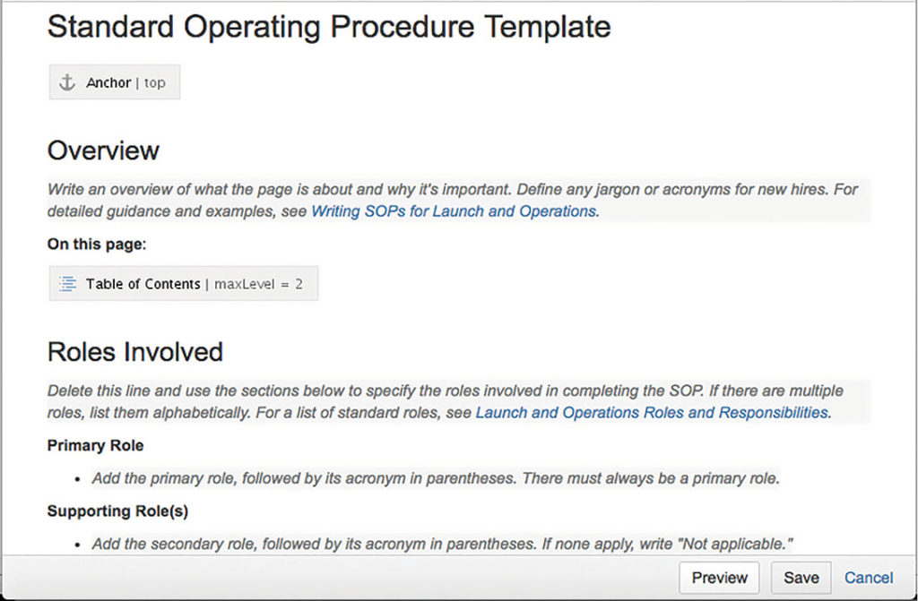
As with print document templates, you need to do your homework to determine the information architecture of your wiki templates—a task that is familiar to many technical communicators. Still, it’s important here to reiterate the principle about designing your wiki templates to be as freestanding as possible. One way to do this is to include a standard overview section (see Figure 1) in all of your templates and pair this section with instructions and examples about how to set the context.
Template Instructions
Speaking of instructions, provide your contributors with solid information on how to find and implement the templates. Write a short guide on your wiki that describes what templates are available, how to find them, and how best to implement them.
A critical part of this approach is embedding instructional text in the page templates themselves. This also happens to be one of the hardest parts. You want instructional text that is short and unintimidating, while also clear and specific enough to guide users in writing high-quality content. Use concise commands and add links to polished sample pages and examples. Also, include some writing best practices in your guide and offer weekly office hours and consultations with contributors.
Page Titles
Wiki page titles are often the first thing a user will see in search results before they decide whether a page is applicable to them. As part of your instructions, explain to contributors how to craft a title that follows a consistent pattern and yet differentiates itself from other pages—and how to test the page in the search engine. For example, how does the page appear in the auto-suggestion list? Does it display alongside pages with a similar or identical title, and if so, how can the user distinguish it more clearly?
Page Layout
Confluence makes it delightfully simple to vary the page layout for your wiki pages. The risk is that multiple columns can get squished together on small screens unless you have a special plugin or a mobile app version of your wiki that allows the columns to stack gracefully for smaller screens. I suggest using a single column for all of your wiki templates, left justifying as much of your content as possible, and frequently resizing your browser to test how the content flows.
Page Headings
Long headings (of five to seven words or more) will increase page length on mobile devices due to wrapping, so be sure to mention that in your template instructions and examples. Moreover, you may want to insert a mini table of contents to your wiki templates. As with page columns, the question then becomes how the table will look when the screen size shrinks. The simplest and safest approach is to left justify the table of contents on its own paragraph, but I encourage you to experiment until you arrive at a solution you can live with.
Tables
Limit yourself to two or three columns if you can, since four or more columns will not resize well on mobile devices. Consider breaking up a large table into smaller ones; or as a mobile-friendly alternative use a combination of subheadings and tucked, inline labels to break the content into scannable, standardized chunks.
Conclusion
There is, of course, plenty more to be said on this subject. Metadata, images, videos, hyperlinks—these and many other dimensions of the document design process could be discussed as well. I also think technical communicators would benefit from an in-depth evaluation of approaches such as minimalism and mobile-first design as possible answers to the problems inherent in wiki template design. But you have to start somewhere, and a good first step is to strengthen your understanding of the nature of wiki templates, along with ideas on how best to employ them.
References
Bernhardt, Stephen. 2003. “The Shape of Text to Come: The Texture of Print on Screens.” In Professional Writing and Rhetoric: Readings from the Field, edited by Tim Peeples, 232–249. New York: Pearson Education.
Krug, Steve. 2006. Don’t Make Me Think! A Common Sense Approach to Web Usability. 2nd Edition. Berkley: New Riders Publishing.
Lynch, Patrick J., and Sarah Horton. 2001. Web Style Guide: Basic Design Principles for Creating Web Sites. 2nd ed. New Haven: Yale University Press.
RICHARD RABIL JR. is a Principal Technical Writer at Oracle. He has over 10 years of technical communication experience and holds a master’s degree in technical communication and rhetoric from Texas Tech University. You can follow him on Twitter at @rrabil or check out his blog at richard.rabil.com.