By Tina M. Kister
Everyone who creates content engages in design, either incidentally or intentionally. Incidental design leads to information that is ambiguous, difficult to process, and unappealing. Science-based content design provides you with practical, evidence-based guidelines for making design decisions that naturally facilitate information processing.
I first started formulating the idea of an online program for teaching science-based content design while managing technical proposals for a telehealth company. Our proposals were good, but, with millions of dollars at stake, I wanted them to be great.
As a writer and editor, I would sometimes come across bits of text that just didn’t seem right. I knew from experience how important it was to only make essential changes that added clarity and value. So, before making any changes, I would take a “scientific” approach and use my initial reaction as a starting point for observation and investigation.
I would conduct research and refer to style guides to determine if the text contained an actual error, or if some aspect of it was simply unfamiliar to me. (Humans have a natural affinity for the familiar, and a natural aversion to the unfamiliar, which is not a sound basis for editorial decisions.)1
As I worked on our proposals, I noticed myself having the same sort of response to non-text elements — e.g., noticing that something wasn’t quite right, but not really knowing what it was or how to explain it. Searching for answers in the world of traditional design was seldom productive, because I could only find vague advice like “use transparent headings,” or “use logical colors.”
Because of my background in visual design, I could usually fix a design problem pretty quickly, when I was given the latitude. Often, however, convincing my bosses and colleagues to accept and adopt the changes was another matter entirely. So, just as I had done with the text elements, I started investigating my responses to the non-text elements.
And a whole world opened up to me. A world in which content design — the way you arrange elements on a page or a screen — had order, logic, and reason behind it. I learned about the anatomy of the eye, the neurochemistry of the brain, and the predictable but still unexplained phenomena of the mind. I learned about attention, both voluntary and involuntary. I learned how humans are natural “infovores,” with an innate desire for information. And I learned how high-quality content design rewards and encourages our natural information-seeking behavior.2
I also discovered a rich world in which others are pioneering the use of science in design, particularly for complex, verifiable information — people like Jeff Johnson, Riccardo Mazza, and Noam Tractinsky, all of whom have contributed to this special issue.
As I explored the science of design, a pattern emerged — a pattern in which design decisions either undermined and distracted users from the ideas conveyed by the content, or reinforced and supported the ideas. And I realized that the ability to make well-reasoned design decisions has little to do with talent, subjective aesthetics, or art. Instead, it’s a process that can be taught and learned, and content people who focus on text and language (e.g., writers and editors) make these same types of decisions every day.
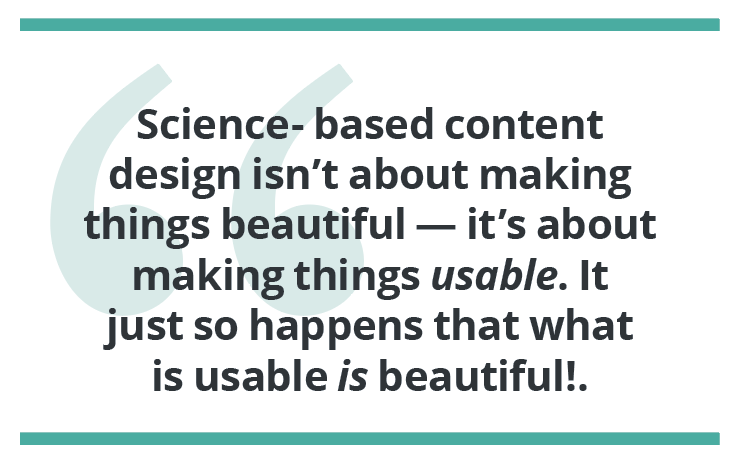
I also learned that, for information developers — those of us who compile, create, or curate any verifiable intelligence into usable form — design isn’t about making things “pretty” or “beautiful,” but about making things usable. And, it just so happens that what is usable is beautiful!3,4
So, using the traditional framework for teaching visual design, in which the “basic design elements” are combined with the “basic design principles” to create guidelines, I developed a science-based approach specifically tailored for complex, technical, instructional, and other high-value content. It expands the traditional approach to give you more practical tools for making design decisions and evidence-based guidelines based on the anatomy of the eye, the neurochemistry of the brain, and the phenomena of the mind.
So, What is It?
Science-based content design is both a paradigm and a methodology for creating content that aligns with how human beings naturally perceive and process information. It allows us to extend the skills we use as writers and editors to create information deliverables that work, so that the information we create is easy to find, read, understand, use, and remember. To understand science-based content design, it’s critical to clearly and precisely define the terms “content” and “design,” as both words are highly ambiguous and mean different things to different people.
Content
The term “content” simply refers to the real-world thing that you create and share, whether digitally or physically. In this sense, content does not refer to ideas or meaning — it refers to the actual information product that results from information development.
Content consists of three main components:
- Ideas
- Language
- Design
This definition is valuable because it allows us to focus on what is verifiably perceivable to users, and to tackle each component separately. We can make sure the ideas are sound, the language is apt, and the design reinforces both. (I don’t know how many times I’ve had subject-matter experts, or SMEs, re-explain ideas to me — ideas I already fully understand — when what I needed was for them to make sure the ideas were clear in the content, not in me.)
Design
The term “design,” as a noun, simply refers to the arrangement of things. As a verb, it refers to the act of arranging things. In the context of science-based content design, “design” refers to the act of arranging content elements on a page or a screen, as well as choosing the attributes for each of the elements. The process of design is essentially a process of making decisions and then testing and refining those decisions. In this sense, design has nothing to do with art, creativity, or self-expression, except as a tool — a tool used in nearly all disciplines, whether legal, scientific, educational, industrial, architectural, or political.
Intentional Design
It’s important to note that everyone who creates content engages in design, although often as an incidental, rather than an intentional, act. “Intentional design” refers to conscious design meant to achieve a specific, desired outcome. When design is incidental or careless, it leads to information that is ambiguous, difficult to process, and unappealing.
Content vs. Design
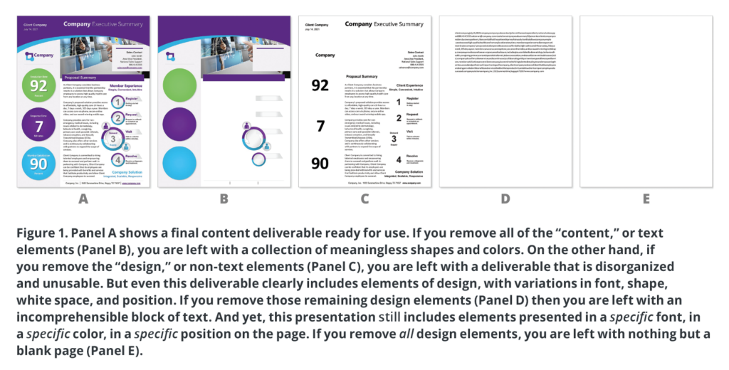
Many people continue to argue over whether content or design is more important, and which should come first in the information-development process. From an information-processing perspective, the idea that content and design exist separately and are somehow opposed to one another is nonsense (Figure 1). Human beings process all content as a collection of visual stimuli that needs to be decoded. Content and design are inseparable, which means that, to be an effective technical communication professional, you must learn to use design intentionally.
In summary, science-based content design teaches you that design consists of a series of decisions and provides you with the skills and knowledge to make evidence-based, content-related design decisions that naturally facilitate information processing. This, in turn, allows your users to spend their time, effort, and cognitive resources on successfully using information to accomplish things in the real world, rather than decoding and interpreting content. In facilitating the success of your users, you also facilitate the success of your organization and yourself.
Interdisciplinary and Inclusive
One of the most wonderful things about science-based content design is that it is truly user-centric. It reflects how human beings — all human beings, regardless of age, economic status, education, or other demographics — perceive and process information. Science-based content design is interdisciplinary at its roots, crossing traditional boundaries to combine knowledge from fields such as vision research and ophthalmology, neuroscience, cognition and attention studies, psychophysics and psychology, and even fields such as artificial intelligence and environmental sustainability.
Science-based content design helps us cultivate a deep understanding of how human sensation and perception work, and to turn that understanding into concrete, practical guidelines for developing information — guidelines that take advantage of the way our attention is directed and disrupted; the way we scan documents before reading them; the way we make associations based on our past experiences; the way we process both text and non-text as visual stimuli — and so much more.
Example: Complementary Colors
A few years ago, while working as a business process engineer, I was helping my boss prepare a report. He wanted to use the company’s official colors for the report cover, so he chose green for the background and red for the title. While his general instinct was aligned with “good” (i.e, effective) design, the execution was problematic (Figure 2).
Most people instinctively know that there’s something wrong with this design and may even understand that the problem is rooted in the use of complementary colors (red and green).
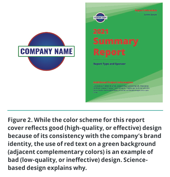
(Complementary colors are color pairs opposite one another on the color wheel, as shown in Figure 3.) Few people, however, understand exactly why using complementary colors presents a problem.
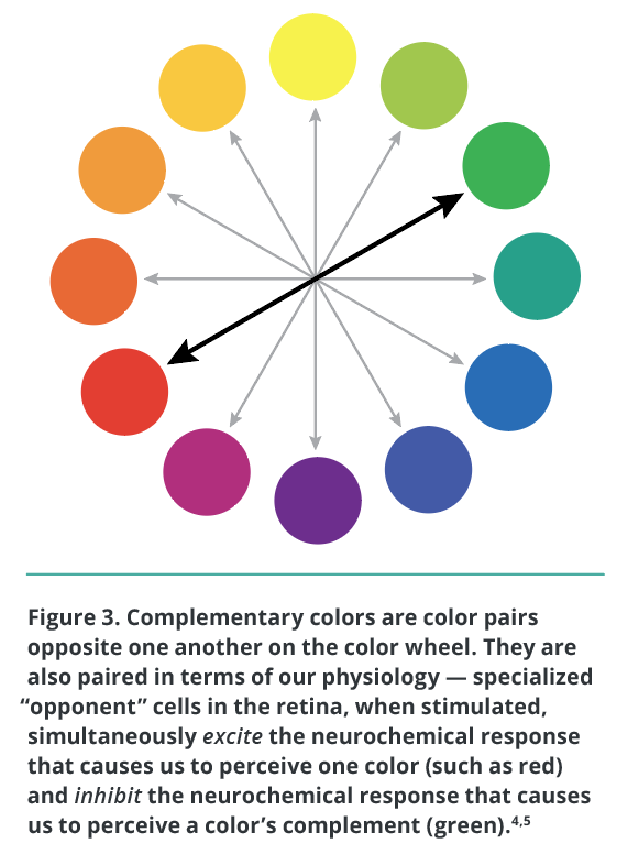
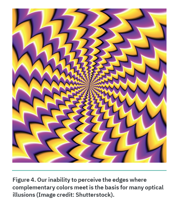
The answer is rooted in our basic physiology. It turns out there are specialized cells involved in color perception, called “opponent” cells, that respond to visual stimuli in a differential way. When activated, they both excite and inhibit the neurochemical signals that tell our brains how to interpret what we see. So, when we perceive a color (such as red), these opponent cells tell our brains to not perceive that color’s complement (in this case, green).5,6
When you combine this differential response with the fact that our eyes are automatically and involuntarily drawn to certain features, including edges,7 we have a perfect storm of visual stimuli. In essence, we are simply unable to perceive the edge where green and red meet. This phenomenon is the basis for many optical illusions (Figure 4).
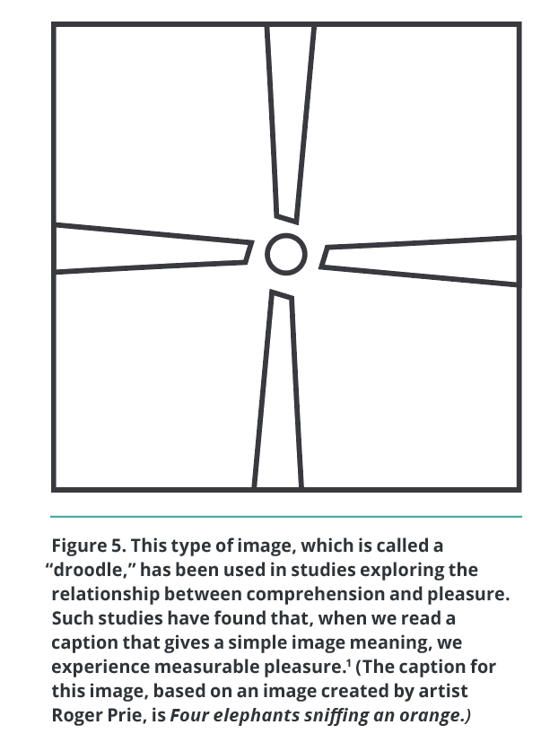
This is one example of how poor content-design decisions can impede our ability to both perceive and comprehend information. This, in turn, prevents us from experiencing the pleasure of successfully acquiring information (Figure 5).2,8
Conclusion
Just as science-based content design is inherently interdisciplinary in its roots, it’s also interdisciplinary in its application. You can use it to create effective content across all fields, genres, and media. You can use it regardless of whether your content is related to software or health care, is presented in a scientific style or a journalistic style, or if it appears in a slide show or a user manual.
In this “Age of Information,” nearly everyone relies on high-quality content design in daily life, whether planning a weekend getaway or responding to a worldwide pandemic. And yet, too often, information developers are not recognized, valued, and rewarded for the sophisticated skills we cultivate, the spirit of service in which we work, or the critical role we play. With science-based content design, we can show people, rather than just tell people about, the true value of the important work we do.
TINA M. KISTER (tmkister@infodevacademy.com) is the founder of the InfoDev Academy and specializes in taking an interdisciplinary approach to improving information-development processes. She has been called a “thought leader” and “change agent” in technical communication. With a background in both creative and technical communications, as well as certifications in technical communication (CPTC), project management (PMP), proposal management (APMP), and content strategy, Kister provides a rare perspective that synthesizes best practices across traditionally siloed areas of business communications.
References
- Harmon-Jones, Eddie, and John J. B. Allen. 2001. “The Role of Affect in the Mere Exposure Effect: Evidence from Psychophysiological and Individual Differences Approaches.” Personality and Social Psychology Bulletin 27 (7): 889–98. https://doi.org/10.1177/0146167201277011.
- Biederman, Irving, and Edward A. Vessel. 2006. “Perceptual Pleasure and the Brain: A Novel Theory Explains Why the Brain Craves Information and Seeks It Through the Senses.” American Scientist 94: 247–53. http://www.jstor.org/stable/27858773.
- Tractinsky, Noam, Adi S. Katz, and Dror Ikar. 2000. “What Is Beautiful Is Usable.” Interacting with Computers 13: 127–45. https://doi.org/10.1016/S0953-5438(00)00031-X.
- Tuch, Alexandre, Sandra P. Roth, Kasper Hornbæk, Klaus Opwis, and Javier A. Bargas-Avila. 2012. “Is Beautiful Really Usable? Toward Understanding the Relation Between Usability, Aesthetics, and Affect in HCI.” Computers in Human Behavior 28: 1596–1607. https://doi.org/10.1016/j.chb.2012.03.024.
- Goldstein, E. Bruce, and James Brockmole. 2016. Sensation and Perception, 10th Edition. 10th ed. Cengage Learning.
- Pauli, Ruth. 2010. “Opponent Processes in Colour Vision: What Can Afterimages Teach Us.” University of Birmingham.
https://e-space.mmu.ac.uk/576747/1/Pauli%20(Ruth)%202010%20(Birmingham.pdf. - Wolfe, Jeremy M., and Todd S. Horowitz. 2004. “What Attributes Guide the Deployment of Visual Attention and How Do They Do It?” Nature ReviewsNeuroscience 5 (6): 495–501. https://doi.org/10.1038/nrn1411.
- Johnson, Jeff. 2014. Designing with the Mind in Mind: Simple Guide to Understanding User Interface Design Guidelines. 2nd ed. Waltham: Elsevier.