By Kelly Schrank | Associate Fellow
With a little bit of knowledge, time, and research, you can create eye-catching infographics
Whether your clients or employers actually know to call them infographics or they just want more visual representation of information, you may need to present your data in a more visually appealing manner to keep up with changing ways of communicating. Sometimes client or employer complaints reflect a feeling that something isn’t right, but they don’t know how to fix it. This uncertainty may present itself in many ways: How can we make this look nicer? Would this look better in a chart? Could we have an image here?
Even if they aren’t asking for it yet, it’s coming. Infographics are everywhere! People just don’t have the patience or attention span to read long paragraphs. They want short phrases, clear connections between ideas, and content that gets to the point right away.
The concepts behind infographics include elements of data visualization.1
Charts and graphs are used to help people quickly see patterns in data, and icons and other graphic elements are used to catch the reader’s eye or to show the point of the content. This article will discuss the elements of infographics, how to create them using sites and the tools and templates in PowerPoint, and where to look for inspiration when trying to make data and content more visually appealing and easily shareable.
 What is an Infographic?
There are many different types of infographics, but they tend to have some common characteristics.
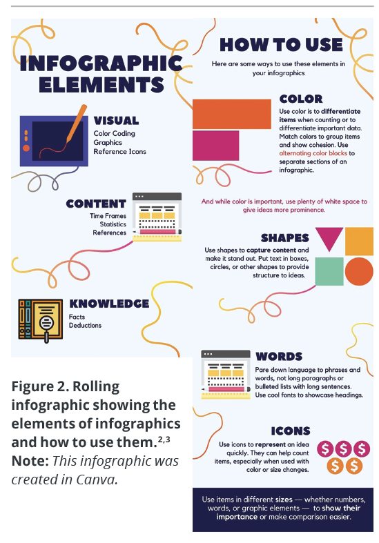
Infographics are created from three elements as shown in Figure 1: visual, content, and knowledge.2 The visual elements come up again and again: color coding, graphics, and reference icons. Also essential to any infographic is the content, which includes time frames and timelines, statistics, and references. And lastly are the facts and deductions that make up the knowledge contained in the infographic. In theory, as a technical communicator, you should be comfortable with the content and knowledge part, but you might be struggling with putting them into a new visual format. This article will discuss this in more detail.
Infographics come in different sizes based on their use:
- The first size is the smallest, and it can be any size or shape. Infographic images are often used to provide visual interest or to make connections between ideas or data.
- The second size is a normal 8.5” x 11” document, either one or two pages in length. These infographics are used for handouts or in place of a document on a website.
- The last size is a rolling infographic, which can also be any size. Rolling infographics often appear as long images on a website, where they can be scrolled through to get to different sections. They can cover a lot of information, but they are usually via a website and shared with a link to the site.
How Do You Create Infographics?
There are different paths you can take to create infographics, depending on your skill level, experience, and the resources available to you. For those with some graphic design skills and experience with software like Adobe Illustrator, creating an infographic from scratch might be a reasonable option. (Even better if you have access to a graphic designer who can help you take your ideas to life!) For those without these skills or software, creating infographics using a website that specializes in infographics would be one easy option. For those with experience with PowerPoint who like to have a little more control over what they create, or who need a more cost-effective option, using the templates and tools in PowerPoint would be another easy path.
Websites
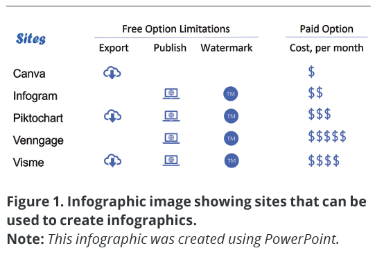
There are many websites that help you create infographics (Figure 1). All you have to do is pick a design and type information into it. With any luck the site’s design will fit your needs, with good colors, shapes, fonts, and the right spaces for the content you need to add. The site can essentially do the graphic design for you.
All the sites listed in Figure 1 have infographic templates. Canva, Piktochart, and Visme also provide a variety of other graphic designs: slide sets, images, posts, and videos. Infogram and Venngage are more focused on the rolling infographic and are the most locked down with the free version of their services. Neither allows you to export the infographics you create on their site with the free version, so all you’ll have is the version on their website with their logo or watermark. Because most clients and employers will not want their infographics to be branded/watermarked or published to the public site of one of these companies, you would have to upgrade to a paid version to be able to use it with clients and employers. The estimated costs in Figure 1 reflect individual accounts (each $ symbol represents $10, and costs reflect those at the time of publication), but upgrading to a team or corporate account would have the added benefit of sharing what you create with your team to allow collaboration.
PowerPoint
Templates
For those with the Office 365 version of PowerPoint and some skills (or those who are willing to learn), you can use PowerPoint and some of its templates to create different types of infographics.
 Current versions of PowerPoint for PC and Mac have native templates for infographics. Some of these available files will be whole slide decks with infographic-like elements, while others contain just one infographic element, like a timeline or a chart. Others have images (called icons in this article), and many are the one- or two-page infographics discussed earlier (some are called posters and others are just named with the topic). Some templates have text that coincides with the topic; others have placeholder text (lorem ipsum). The added benefit of using PowerPoint is the ability to share files with coworkers and collaborate in a tool that is ubiquitous in modern offices.
You can also download PowerPoint infographic templates from different companies for free or a fee; GraphicMama has a list of free templates to get you started.
 Whether using infographic templates provided within PowerPoint or from an outside provider, you can change any of the elements of the template — from its size or shape to the colors, fonts, images, or sizes — just like you can in any other PowerPoint file.
Tools
PowerPoint in Office 365 has many more options than older versions: more options in SmartArt, more icons, and more stock images. If you have an older version of PowerPoint, you will still have templates and SmartArt, but you may not have the same icons or as many stock images to choose from.
SmartArt can be helpful in putting together processes or other structural elements if a template does not have the right elements. After getting the text into the SmartArt, if you need more control over the shapes, you can convert the SmartArt to shapes and move all of the shapes around exactly where you need them.
Icons can accomplish a lot in infographics: They can act as bullets in a list, allow you to show the count of items, or define the text next to them. You can change the icons in PowerPoint to be any size or color, and move them wherever they’re needed to bring visual interest or enhance the reader’s understanding of the content.
Becoming comfortable with changing the colors or sizes of icons and shapes, changing the text font or size, and adjusting the size of the template file itself in PowerPoint can allow you to create an infographic that covers your topic adequately and provides visual interest to your audience without expensive software.
Where Do You Get Inspiration?
Where can you get design ideas, see what’s in fashion (yes, it’s constantly evolving), and see what good design looks like? One way to spark your imagination is to go to your search engine of choice and search for infographics. Just be sure to search for images by choosing the Images tab in Google, for instance, instead of the standard All tab, which shows you all of the search engine results. You don’t necessarily want to read about infographics; the point here is to inundate yourself with images of infographics to see what they look like as a whole body of knowledge. That way, you’re sure to get some ideas for your own projects.
While on the Internet, check out sites like Canva, Piktochart, and Visme, all of which offer infographic templates, even if you don’t use them to create your infographics. Also open PowerPoint to explore its options, especially the templates, SmartArt, and icons.
Infographics aren’t going away anytime soon, so it’s a good idea to get familiar with the elements of infographics and how you can use them to visually represent your information.
References
- Great Learning Team. 2020. “Understanding Data Visualization Techniques.” Great Learning. https://www
.mygreatlearning.com/blog/understanding-data-visualization-techniques/. - Roy, Sneh. 2009. “The Anatomy of an Infographic: 5 Steps to Create a Powerful Visual.” SpyreStudios. https://spyrestudios.com/the-anatomy-of-an-infographic-5-steps-to-create-a-powerful-visual/.
- Graphic Mama Blog. 2021. 35+ Free Infographic PowerPoint Templates to Power Your Presentations. https://www.graphicmama.com/blog/infographic-powerpoint-templates.

KELLY SCHRANK (kelly@headbookworm.com) has worked in technical and medical communication for over 20 years. Through her business, Bookworm Editing Services (https://www.headbookworm.com), she brings consistency, structure, and clarity to her clients’ content regardless of whether she is writing content like blog posts, style guides, and standard operating procedures or editing formulary dossiers, manuscripts, proposals, slide decks, and training materials. Kelly is an associate fellow of STC and certified by the Board of Editors in the Life Sciences, with a master’s degree in technical communication.