By Anita Matechuk | STC Member
Accessible descriptions are necessary to aid those who are visionimpaired, have low bandwidth, or have safety features enabled. Understand your audience and content to develop the best text alternatives.
When researching the best practices for screenshot alt text in my final school project, I discovered that there are more options than I realized. Unfortunately, I could not find a defined term that included all the available options in my research. Therefore, for this article, I decided on the term Accessible Description as my research revealed many different formats and ways to make a visual element accessible to various audiences.
Some of the format options for making visual elements accessible include:
- Audio descriptions like described video and narration
- Text alternatives like alt text, captions, and image descriptions
Accessible descriptions can support an audience:
- Using screen readers
- Using screen magnifiers
- Using low bandwidth internet service
- Using safety features, including autoplay off
- Using text or audio to increase their understanding of a visual element
For the purposes of this article, I will focus primarily on alternative text formats, which have lower bandwidth considerations than audio descriptions. This makes them readily available to all audiences.
Defining Accessible Description Terms
Accessible description terminology is not always consistent, as each author may provide a slight variation in the terms used in describing visual (non-text) elements. The required content in the accessible description may also change from author to author
While some of the terms may be used interchangeably in other content, this article uses the following definitions found by examining and combining the researched terms.
Accessible Descriptions
The end product from converting a non-text element into audio or text-based form supporting audience accessibility or clarity.
Alt Text (Alternative Text)
The text alternative is embedded into a non-text element and is not available visually in the technical communication. The alt text only displays if the non-text element fails to load on a website or social media post.
Recommended length: 125 characters or less to work with popular screen readers.1
Audio Descriptions
The end product from converting non-text elements into audio form — for example, audio files like described video and narration.2
Captions
The text alternative is attached to a non-text element in the technical communication. Captions are available for visual and audio audiences — for example, the textbox attached to a photograph on a website or social media post.3
Image Descriptions
The text alternative is described in the main body of the technical communication. The text does not automatically move with the non-text element and is available for visual and audio audiences.
Recommended length: 280 characters or less.1
Long Descriptions
Long or complicated descriptions may require additional navigation clues; these can be provided in an appendix or a separate webpage.
Short Descriptions
Concise descriptions can be listened to all at once without needing additional navigation clues. These are provided along with the non-text element and can link to a longer description.
Text Alternatives
The end product from converting non-text elements into text form — for example, alt text, captions, and image descriptions. Web Content Accessibility Guidelines (WCAG)-compliant4 websites require text alternatives and may include short and long descriptions.
Researching Accessible Description Best Practices
While I could not find defined requirements for creating all technical communication accessible descriptions, I could still find some valuable information.
Best Practices for Photos and Infographics
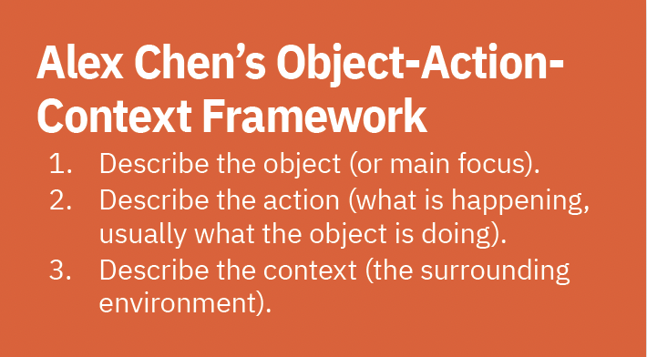
Alex Chen’s article “How to Write an Image Description”3 discusses using the object-action-context framework when writing text alternatives for photographs and infographics. The best practices recommended include:
- Use the object-action-context framework to keep text alternatives objective, concise, and descriptive.
- Describe race and gender if it is relevant to the image and you know how they identify. Be consistent in your descriptions of all individuals in an image.
- Break complex visual elements into sections and describe each section in order.
- Include all text from the visual element.
- Capitalize each word in a hashtag so screen readers can recognize the individual words.
- Avoid using all caps as screenreaders may read them as individual letters.
- Use captions to support all individuals whether they use screen magnifiers, screen readers, or not.
Best Practices for Complex Image Types
Harvard University’s article “Write Good Alt Text to Describe Images”5 discusses writing alt text for complex image types and using testing tools to see if your webpage makes sense without the images. The best practices recommended include:
- Do not include the words “image of” or “photo of.”
- Use alt text to describe the intended action an icon or image represents, not the look of the icon or image.
- Use both the alt text and a long description to describe a complex visual element.
- Test your text alternatives by hiding the visual elements and displaying the alt text. Make sure the page makes sense without the visual elements.
Best practices for Map Audio Descriptions
Megan Conway, Brett Oppegaard, and Tuyet Hayes discuss their research into how to provide audio descriptions for maps in their article “Audio Descriptions: Making Useful Maps for Blind and Visually Impaired People.”2 Their best practices include:
- Describe the content in layers. Start with the largest purpose of the map and work towards the smallest.
- Use short and long descriptions.
- Determine the length of the audio description based on the purpose and content of each map.
- Describe the map’s purpose, not the look of the map. Purposes for a map include:
- orientation and movement
- exploration of locations of interest
- learning about a place
Best Practices for GIFs and Other Visual Elements
Veronica Lewis’s blog Veroniiiica6 provides information about writing text alternatives for different visual elements and platforms. Veronica adapts her best practice recommendations to the visual elements she discusses in her blog, including food photographs, GIFs, and graphic novels.
In her article “How to Write Alt Text and Image Descriptions for the Visually Impaired,”1 her recommendations include:
- Write the text in the visual element verbatim in the alt text, using proper spelling, capitalization, and grammar.
- Provide the essential information in the alt text and additional information in an image description.
- Keep alt text length to 125 characters or less to work with popular screen readers.
- Keep image description length to 280 characters or less.
- Type “null” in the alt text for decorative only images instead of leaving them blank.
She provides additional recommendations in her article How to Write Alt Text for GIFs7 to support an audience with the autoplay feature on GIFs turned off for safety concerns. Her additional recommendations for GIFs include:
- Write “trigger warning” or “TW” in the text alternative for flashing lights, strobe lights, or photosensitivity warnings.
- Write “image description” or “ID” before the text alternative.
Text Alternatives for Screenshots
My research showed that authors on the subject recommended directing the audience directly to the source of the screenshot instead of providing an accessible description.
While I agreed it was better to provide a link to a website or document for my audience to review instead of describing it, I wasn’t sure if this meant user interface screenshots were decorative or still provided valuable information. Also, if screenshots were only decorative for some, did that mean they were only decorative for all of my audience? How would the audience determine the value of following the links to the original material without some alt-text context?
The closest research I found on creating text alternatives for screenshots was audio descriptions for maps: describe the map’s purpose and not the map’s look.2 This method made the most sense for my project as I provided screenshots to show my audience how to navigate the user interface quickly.
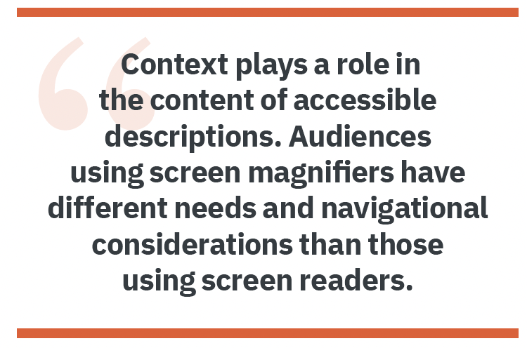
I realized that while the purpose of my screenshots stayed the same for multiple audiences, the content of my text alternatives needed to change based on how my audience accessed the information. For example, audiences using a screen magnifier or wanting more information likely want components described, including dropdown boxes and popups. However, screen readers navigate with the keyboard linearly,8 so individuals using a screen reader likely want the information broken down into the sections defined for screen readers.
Screen reader navigation is similar to navigating from a table of contents made up of links. Each program defines the sections the user interface includes in its screen reader navigation. As each program is different, writing the text alternatives for user interface screenshots requires researching the terms for each user interface separately. I found reading “Make Your Word Documents Accessible to People with Disabilities”9 helpful in understanding how a screen reader navigates a user interface as it was a user interface I understood.
Each type of text alternative can have advantages and disadvantages. For example, alt text is only available for an audience using a screen reader or when the visual elements aren’t displayed. However, it saves space on the screen and displays for all audiences if the visual element fails to display.
Recommendations for User Interface Screenshots
I recommend using alt text to support individuals navigating with a screen reader and a caption or image description to support individuals using a screen magnifier or needing clarification of the navigation the screenshot demonstrates. For highly detailed screenshots, include a link to a long description with a return link to the screenshot in the long description. A WCAG-compliant4 website must comply with standards, including the distance and navigational links between a text alternative and the visual element.
Alt text for user interface screenshots
I decided to provide screen reader navigation information in the alt text of my screenshots, as individuals using a screen reader would have it available, and it wouldn’t take up space in my document.
My content for the alt text for screen reader navigation included:
Step number — if displayed in the screenshot
Location — using the same terms as a screen reader
Desired action or selection — using the same terms as a screen reader
Captions and image descriptions for user interface screenshots
By including image descriptions, I provided navigational support to my audiences not using screen readers. I did not find an accessibility difference between providing captions or image descriptions in my research. Therefore, I provided image descriptions for my screenshots as captions didn’t fit my document formatting.
My content for the image descriptions for navigation included:
- Step number — if displayed in the screenshot
- Location — provide information like colors, dropdowns boxes, and popups
- Desired action or selection — using the same terms as on the screenshot
Conclusion
The type and scope of accessible description varies based on the type of visual element and the audience’s limitations. Take the time to understand both your content and audience to create truly accessible descriptions.
References
- Lewis, Veronica. 2018. “How to Write Alt Text and Image Descriptions for the visually impaired.” Perkins SCHOOL FOR BLIND eLEARNING. https://www.perkinselearning.org/technology/blog/how-write-alt-text-and-image-descriptions-visually-impaired.
- Conway, Megan, Brett Oppegaard, and Tuyet Hayes. 2020. “Audio Description: Making Useful Maps for Blind and Visually Impaired People.” Technical Communication Online. May. https://www.stc.org/techcomm/2020/04/28/audio-description-making-useful-maps-for-blind-and-visually-impaired-people/.
- Chen, Alex. 2020. “How to write an image description.” UX Collective. Accessed April 17, 2022. https://uxdesign.cc/how-to-write-an-image-description-2f30d3bf5546. https://www.w3.org/TR/2008/REC-WCAG20-20081211/
- Harvard University. n.d. “Write Good Alt Text to Describe Images.” Harvard University Digital Accessibility. Accessed April 17, 2022. https://accessibility.huit.harvard.edu/describe-content-images.
- Lewis, Veronica. n.d. Veroniiiica. Accessed April 23, 2022. https://veroniiiica.com/
- Lewis, Veronica. n.d. “How to Write Alt Text for GIFs.” Veroniiiica Veronica with Four Eyes. Accessed April 21, 2022. https://veroniiiica.com/2020/02/03/how-to-write-alt-text-for-gifs/
- Institute for Disability Research, Policy, and Practice. 2017. “Designing for Screen Reader Compatibility.” WebAIM Web Accessibility in Mind. https://webaim.org/techniques/screenreader/.
- Microsoft. n.d. “Make Your Word Documents Accessible to People With Disabilities.” Microsoft Support. Accessed November 27, 2021. https://support.microsoft.com/en-us/office/make-your-word-documents-accessible-to-people-with-disabilities-d9bf3683-87ac-47ea-b91a-78dcacb3c66d.
 ANITA MATECHUK (linkedin.com/in/anita-matechuk-5b20511a4) is a recent graduate of Simon Fraser University’s Technical Communication Certificate program. Although new to the tech comm field, she has a BASc in Electronic Systems Engineering and experience in the banking industry. She is currently working as a freelance technical writer.