By Crystal Elerson | STC Member and Terry Smith | STC Student Member
In the last few decades, personal computers, personal printers, and Web 2.0 have changed the speed and methods we use to distribute information. As bulky CRT computer monitors have evolved into high-definition flat screen monitors, mobile phones have become touch screen devices, and computer tablets have become common devices, the methods audiences use to consume information have dramatically changed. Our understanding of best practices for document design in these new display systems is lagging. In the near future, we will need to have best practice guidelines for document design beyond paper in areas such as virtual reality (VR). Without best practice guidelines, early information dissemination using VR is problematic because users have not yet been trained for what to expect and where to look—they are relying on older, established reading habits to use these new forms on technology. With any piece of technical communication, being able to understand the information given is the most important factor an audience uses to judge material.
Our Current Knowledge of Type
Much research already exists about the legibility of typefaces in different media. On paper, serif fonts produce the best results for reading because we read, or skim, by recognizing the shapes of words. In print media, the feet on the serif fonts help maintain the shapes of words. However, early CRT computer monitors made reading serif fonts more difficult because the technology was unable to render the serifs clearly, making the shapes of the words more difficult to distinguish. Sans-serif fonts quickly became the type of choice for computer writing and other low-resolution technology, such as overhead projectors. Despite the modern improvements in technology that allow fonts with serifs to be rendered clearly on screens, the trend has continued toward the use of sans-serif fonts.
Some evidence suggests that people who learned to read on computers developed the ability to read sans-serif fonts almost as quickly as serif fonts (Arditi and Cho 2005); however, now that the rendering technology has improved, we need new research to test whether those same people would read faster if given text on-screen regularly in serif fonts.
At present, we have been unable to find in-depth research on fonts or document design that examines VR. Because these technologies are becoming more accessible to the public, we began to consider how technical communicators would use these new technologies and how to discover, define, and teach a set of best practices to our students to prepare them for the coming technology changes that will occur during their careers.
Our Understanding of Type in VR
In VR, technical communicators may have more control over directing audience attention because VR blocks out environmental distractions by limiting them from view. As we evolve toward more interactive documents, technical writers who work with document design will need to consider leading the audience in new ways. For example, currently, document designers use features such as color, rule lines, text boxes, images, font, display size, organization, and position to design their documents. In VR, document designers will need to add new considerations such as time, layering, and additional context because users can move through documents in a virtual environment.
One example of this concept of moving through a document in a virtual environment comes from a VR comic book called Nanite Fulcrum where the creators wrote and developed a virtual comic book (which uses a comic book style font). In the graphic novel, the audience reads as though reading a normal comic book until the audience reaches a panel outlined in blue. The audience can grasp the blue panel and step inside, as if stepping inside the scene. Inside the panel, the audience sees the formerly flat comic book panel as a VR scene. In one panel, the creators hid a simple game. This method of reading was immersive because it had many of the qualities of a video, while still being interactive for the user. If these concepts were applied to instructional writing or other forms of document design, gaining and controlling reader attention could become much easier.
Font choice plays an important role in document design because low-context readers rely solely on the text provided for the information they need. Text, by itself, lacks media richness or media naturalness information (Daft and Lengel 1986; Kock 2005). High-context readers who take in information from all parts of document design, are privy to additional contextual factors, yet still benefit from document design that uses the appropriate font for the design. Low-context readers, however, will have a much higher reading comprehension challenge that depends more on the textual information in the document. To best serve both high- and low-context audiences and overcome the limitations of poor media richness and naturalness, technical communications must design their documents with ease of reading and absorbing information in mind. One valuable area that this article examines is the role of serif and sans-serif fonts in document design beyond print media, with specific focus on VR.
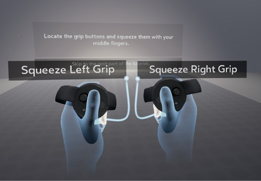
With the idea that technical communicators will soon need to design content for VR, we conducted informal research to look at VR programs for readability. For the preliminary research, we asked eight users of varying age groups and computer skill levels to use an Oculus Rift and comment on the Oculus Touch training program called First Contact and Deskverse.
Examination of First Contact Training
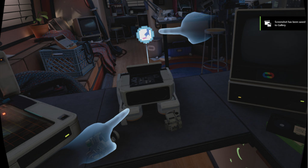
We asked users to interact with the Oculus Touch training program First Contact because training is a large part of technical communication. In this program, the training begins with black text on a white screen in a sans-serif font. The environment is a simple one, which allows the user to focus on the text. When the user looks around the VR “room,” the user sees only white with gridlines extending in all directions. This virtual environment reminded the users of a holodeck on Star Trek: The Next Generation. They commented that the text was easy to read but a little out of focus. After the initial text-only training, the program moves the user into a well-developed environment and uses icons to represent speech from a virtual robot that trains the user. Of the programs the users used, First Contact was the favorite because of the variety of training available and the similarity of the of the training robot in the program to the pop culture success film, Wall-E.
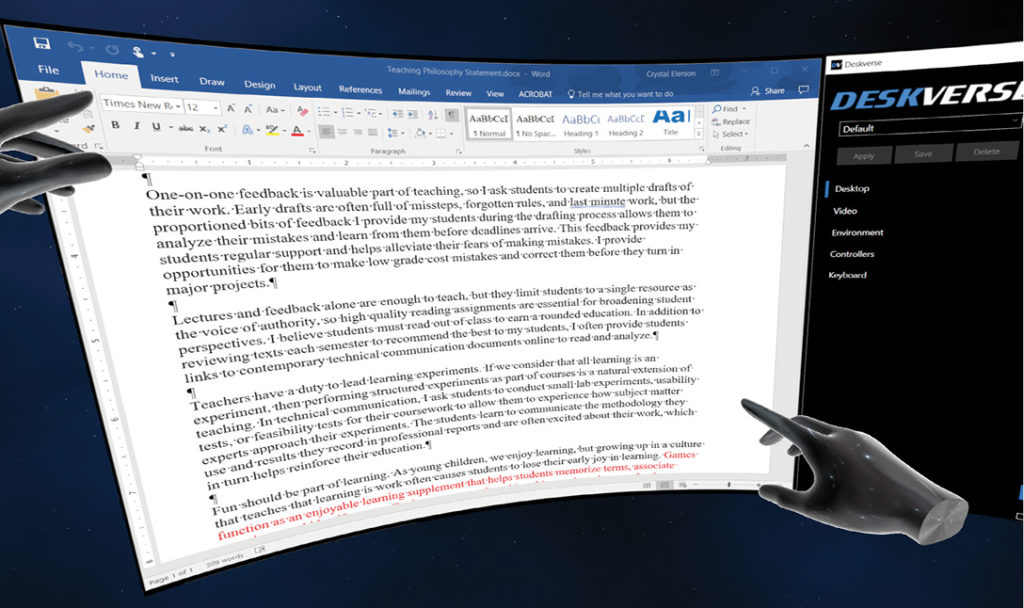
Examination of Deskverse
We asked users to interact with Deskverse because it’s a productivity application that allows users to view their standard desktop through the Oculus. This program is one of the few currently available that allows users to work in their usual desktop environment on documents in their word processing or design programs. At first, this idea seemed like an excellent way to block out other environmental distractions; however, the drawbacks to using Deskverse (or a similar product) in the current form come directly from readability and these problems outweighed the benefits of reduced distractions by introducing new problems. The users commented that sans-serif fonts were difficult to read but that serif fonts were even more difficult. In all cases, the users complained of eye fatigue in 15 minutes or less of use. They noted that the text was just out of focus enough to cause headaches, and each user said that they would not use VR in its current form for everyday work such as data entry, report writing, email communication, text programs, or tracking data of any kind.
Examination of VR in Meetings
Crystal Elerson tried using the Oculus for an online meeting using Zoom through Deskverse. During this meeting, different participants shared screens from their usual computers or mobile phones through Zoom, and Elerson took notes in Microsoft Word. The meeting lasted for one hour, which was longer than the previous test with Deskverse. The results were the same. By the end of the meeting, Elerson suffered from eye fatigue, a headache, and during the meeting had to remove the headset multiple times to check her laptop screen to make sure she had read the text correctly. Regardless of the zoom level or Oculus lens focus, reading in VR felt like reading on an old CRT monitor. Overall, trying to focus on the more difficult-to-read text proved to be distracting.
Conclusions
At the end of the preliminary research, we concluded that further document design testing is necessary for VR because the current methods are counter-productive. The preliminary research was informal and relatively unstructured, so the results need to be reproduced under more guided testing conditions. However, in the interim, technical communication document designers who wish to prepare for VR could use these guidelines as a starting place for developing best practices:
- When text is necessary in VR, use a sans-serif font.
- When possible, use icons or graphics to communicate information.
- Users respond best to interactive tutorials, so design the document for interaction.
References
Arditi, Aries, and Jianna Cho. 2005. “Serifs and Font Legibility.” Vision Research 45 (23): 2926–2933. http://doi.org/10.1016/j.visres.2005.06.013.
Daft, Richard L., and Robert H. Lengel. 1986. “Organizational Information Requirements, Media Richness and Structural Design.” Management Science 32 (5): 554–571. doi:10.1287/mnsc.32.5.554.
Deskverse. (version 1.5). [Computer program]. Deskverse. 2017. http://www.deskverse.com/.
First Contact. (version 1.1.9). [Computer program]. Oculus Rift. 2016. https://www.oculus.com/experiences/rift/1217155751659625/.
Kock, Ned. 2005. “Media Richness or Media Naturalness? The Evolution of Our Biological Communication Apparatus and Its Influence on Our Behavior toward E-communication Tools.” IEEE Transactions on Professional Communication 48 (2): 117–30.
CRYSTAL ELERSON, PhD, (Elerson@unt.edu) has been teaching technical communication since 2003 at the university level. Elerson works as a lecturer in the Department of Technical Communication at the University of North Texas. Elerson’s research focuses on writing style, reading faces, and virtual reality.
TERRY SMITH (Terry.Smith@ttu.edu) is a graduate student at Texas Tech University. He has been teaching at the university level since 2002 and teaching technical communication since 2007. Smith will serve as a research assistant for applied research into the topic of this article.