By Jonah Schwartz | STC Member
Lost in Localization
Culturally appropriate colors are a necessity in all forms of documentation. Single-sourcing and structured authoring tools have enabled technical communicators to localize content, targeting information to different audiences simultaneously. However, there are circumstances where information cannot be localized.
Conferences and live presentations—specifically within multicultural international organizations (MIOs)—are spaces where information is received collectively, but interpreted and acted on through individual cultural lenses. In these spaces, we get one opportunity to deliver this information effectively. Data has buying power, regulates decision-making, and alters worldviews. Since color meaning varies greatly between cultures, graphical data has the potential to influence your audience in unintended ways if those colors conflict with their cultural values.
This article exposes a research gap between data visualization and intercultural communication, explains why this is a problem, and offers a surprisingly straightforward solution: graphical color context must be explained to ensure that data is interpreted correctly.
It Begins with the Style Guides
MIOs can range from the United Nations, the International Olympic Committee, and Doctors Without Borders to standards organizations, trade associations, and multinational businesses. Whether private or intergovernmental, MIOs are comprised of members from multiple countries, often relying on a single style guide to produce their documentation.
Table 1. Multicultural International Organizations (MIOs) and number of Member States (May 2017) showing the depth of cultural needs that must be addressed simultaneously in MIOs.
MIO |
Member States |
|---|---|
| United Nations | 193 |
| INTERPOL | 190 |
| IEEE | 160+* |
| Underwriters Laboratories | 113 |
| International Olympic Committee | 95 |
| International Astronomical Union | 73 |
| MSF/Doctors Without Borders | 60+* |
| Commonwealth of Nations | 52 |
| 3GPP | 42+* |
| CERN | 38+* |
| IUPAC | 35 |
| ITER | 35 |
| NATO | 28 |
| FERMILAB | 23 |
*Precise number not provided by MIO
In other words, layout and formatting rules are uniform and don’t change based on where the author lives or where the document will be delivered. Many MIO style guides are unavailable to the public, thus impossible to evaluate. The others, however, vary greatly in the specificity and granularity of their rules. Some are loose and ambiguous, while others, like CERN, are rigid and exhaustive in spelling and formatting conventions.
Color was seldom mentioned in the style guides I investigated, but none of them stated how color should be used in image and graphical data, only whether it should or can be used. While there is no shortage of research on intercultural communication, international color perception and meaning, or effective graph design (particularly hue and intensity), there is limited research on whether, and how, data visualization colors affect multicultural users.
This leads to some compelling questions:
- If not, why not? Why would color be such a salient design element for images and text, but not graphs? If true, this discovery would change many documentation methodologies. I don’t believe this is the case.
- If so, what can be done about it? This is my research question, and the one to which I offer a solution: we must explain and justify our color choices.
- And perhaps most troubling: If you change the visualization colors, do you change how it’s interpreted? The research indicates that this is true.
The rhetorical power of graph colors needs to be better understood. I am not referring to generally accepted design maxims, such as limiting colors and making them readable for black-and-white printing. The United Nation’s style guide cautions writers to be conscientious of this, while IEEE’s comes the closest when they say, “Color in figures shall not be required for proper interpretation of the information” (24). But this is ambiguous. A well-designed graph must be readable without explanation. A legend will tell you blue represents X and red represents Y—but what do blue and red communicate? When you present to an audience of mixed cultures and nationalities simultaneously (i.e., via conference, presentation, or broadcast/webcast), that answer will change depending on who is being asked.
Color Meaning Is Not Intuitive
Color meaning not only varies between cultures but between industries. John Brockmann states, “Green for process control engineers means ‘nominal or safe,’ for financial managers it means ‘profitable,’ and for healthcare workers it means ‘infected’.” (158).
In the United States, red and blue each have their own spectra of meaning, but when paired, new and often contradictory levels of utility are formed across a disparate range of fields and applications.
Table 2. Examples of industrial color coding of red and blue in the United States, showing critical, but disparate, variations in meaning. These are not international standards, thus color must be explained.
Application |
Red |
Blue |
|---|---|---|
| Blood collection tube | No additive | Sodium citrate |
| Chemistry model | Oxygen | Nitrogen |
| Compressed air cylinder | Flammable gas | Nitrous oxide |
| Electrical wiring | Line 1 | Line 3 |
| Fire diamond | Fire hazard | Health hazard |
| Fire hydrant | ≤500 GPM | ≥1500 GPM |
| HAZMAT warning label | Dangerous when wet | Flammable |
| Highway traffic sign | Regulatory information | Service information |
| Hospital emergency code | Fire | Cardiac arrest |
| Pavement reflector | Wrong way | Fire hydrant |
| Pipe marking | Fire quenching fluid | Compressed air |
| Railroad signal | Stop and proceed | Workers under train |
| Runway lighting | Runway ends | Taxiway |
| Utility lines | Electric | Potable water |
We partition multiple color meanings simultaneously without difficulty—while acquiring new ones—because we understand these contexts either through experience or instruction. Color has no inherent value; there are no universal or neutral colors that effectively suit the needs of highly stratified audiences who may vary in skill and literacy levels. Thus, when information cannot be localized to suit audience needs, explaining colors aligns author intent with audience understanding.
We ascribe contextual meaning to colors, and only once intent is explained and agreed upon can we act appropriately and safely. Yet we don’t do this with data visualizations. If someone charged with handling dangerous chemicals, landing an airplane, or interpreting a weather map is unfamiliar with the respective color usages, successful completion of the task cannot be guaranteed. Ameersing Luximon and his team identified varying interpretations of the threat-level of hazard color codes (red, orange, yellow) between Chinese and Western audiences, but not the associated words (warning, danger, caution). Whether interpretation would change based on which explanation is given—or their ideal wording—is an open question.
In 1998, IBM researchers Bernice Rogowitz and Lloyd Treinish wrote about communication failures in data visualization. They note “standard uses of color can distort the meaning of the underlying data and can lead the analyst to incorrect evaluations, conclusions, or decisions.… Creating visualizations… is typically ad hoc, and you often must spend many iterations to create the ‘right’ visualization.” It’s worth noting that they were speaking of content creators misleading themselves with inadequate color choices. This confusion would arguably be passed onto audiences.
MIO audiences would benefit from understanding author intent. Figure 2 reflects identical data interpreted by two parties. Similarly, Jan de Leeuw shows how a simple table signals emotions by mixing hierarchy with intensity level (Figure 3).
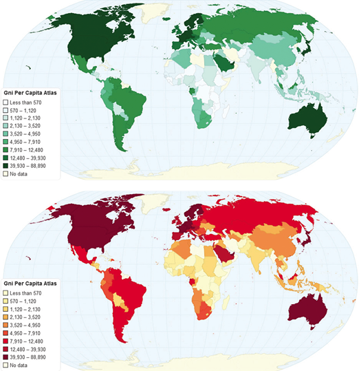
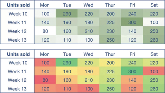
These figures illustrate the relationship between data and color perception, but neither are inherently more aesthetic or effective than the other. While the comparisons are alarming, both can fulfill their goal if the audience understands the intended color meaning.
Explaining Color Choices Resolves Problems
There seem to be few reasoned color choices in charts, graphs, and data visualizations:
- Software defaults (no action taken)
- Organizational/sponsor colors
- High contrast colors to increase salience or visibility (perhaps chosen arbitrarily)
- Style guide specifications (None exist that I can find)
- Personal preference/favorite color (Never do this)
- To draw attention; to alarm or pacify (for example, red for danger; blue because it’s relaxing)
The only individuals who know why these colors are chosen are the content creators. Nations in MIOs should consider clarifying their color choices, because all communicators, no matter where they are from, have the responsibility to ensure that their information is received as intended. Evergreen and Emery state in their data visualization checklist that colors should not use defaults, and rather represent one's brand, organization, or client.
To be effective, graphs must be quickly and easily comprehended, without the viewer needing to be told how to read them. Unfortunately, this means misuse or misunderstanding of color could quickly affect how the data is perceived. As Figures 2 and 3 reveal, color informs meaning, and different emotions are evoked at a mere glance. It may seem counter-intuitive to explain color meaning if the graph is already readable, but Table 2 shows that we already explain color meanings in myriad contexts. Diversified audiences have to suspend their cultural association of these colors to correctly or effectively interpret the data.
Palette generators that reflect a specific multicultural audience’s color associations are helpful tools, but in these, as well, there is no clean or universal color scheme in spite of context and purpose. Much like numerical data, colors can mislead or confuse, thus identifying author intent would relieve audiences of relying on their own interpretations. Visualizations designed with best practices still communicate color meaning that exists independent of the data. However, stating, for example, “color represents deforestation rate” may confuse audiences if that color is associated with growth.
If content creators are as conscientious about the cultural impact of our color choices as we are in other areas of documentation, data can be interpreted more precisely.
How to Prepare Graphical Color Explanations
Explanations must not interfere with graph readability, should only explain color purpose (not the data itself), and should be footnoted, as is common in many visualizations. As there are few reliable reasons for specific color choices, MIOs could amend their style guides to provide instruction on how to write an explanation for each situation. Clarifying intent (for example, “colors use software defaults” or “color represents organizational colors”) is salient, because it is objective and disconnected from emotion.
How instructions are written, the colors they use, and the language in which they’re written will vary by organization and situation, but that shouldn’t be a problem if the explanations are clear and concise. Documents—and these descriptions—should be translated as needed, but if data colors are localized (or changed) too, multiple versions with varying colors risks confusing audiences.
Applications Beyond Conferences and Presentations
East Carolina University Professor Dr. Michael Albers’ document design assignments call for justification papers that use research to defend and justify choices of typeface, image placement, color, and so forth. I’ve asked other technical communicators if they exert this kind of thoughtfulness in their own work, and the predominant answer is “no.” If we better understand our own design choices, then meaning will be clearer to our audiences. That meaning should be explicitly stated.
This approach has practical and commercial applications including:
- Health/medical literacy in patient documentation and imaging (especially if colors can be conflated with sickness or wellbeing)
- Internationally targeted news, science, and educational content distributed via print, Web, television, and social media (for example, YouTube, CNN International)
- Travel guides, which can further explain traffic signs, pavement markings, emergency signals, and most thoughtfully the color values of that country
- Historical research, to understand heraldic and geopolitical designs
- Wayfinding in complex and culturally diverse locations
- International conferences
- International airports
- International sporting venues (for example, World Cup, Olympic Stadium)
Josephine Caricato reports her findings on using color in live presentations. While she was not talking about data design specifically, she notes, “If cultures map colors differently, knowledge of color distinction will help a visual designer (a) reduce reaction time, (b) decrease message distortion, and (c) defer opposition within an audience” (505). Jo Mackiewicz’s research shows how graph color attractiveness varies between Eastern and Western audiences, but notes more research is needed on color interpretations, especially when text is added to images, much like Ameersing did. These explanations are a good start.
Visual information communicates a narrative that can willfully or unknowingly manipulate an audience’s emotions. When communicating to highly diversified audiences, graphical color choices must be clarified if we wish for them to be effective and interpreted as intended. It is incumbent upon us to ensure the intent of our data is imparted just as clearly as the data itself. I invite you to test this in your own workplace. Bring richer meaning to your multicultural-international users, and let us show how effective these explanations are.
References
“2014 IEEE-SA Standards Style Manual.” IEEE.org. Accessed 19 March 2017. http://sites.ieee.org/sagroups-9274-1-1/documents/2018/06/2014-ieee-sa-standards-style-manual.pdf/.
“3rd Generation Partnership Project; Technical Specification Group Services and System Aspects; Specification Drafting Rules.” Valbonne, France: 3GPP.org. http://www.3gpp.org/ftp/Specs/archive/21_series/21.801/21801-f00.zip.
“Gni Per Capita Atlas Method Current Us.” ChartsBin.com. 21 January 2013. Accessed 22 August 2018. http://chartsbin.com/view/10537.
“United States Road Symbol Signs.” U.S. Department of Transportation, Federal Highway Administration. Accessed 25 April 2016. http://mutcd.fhwa.dot.gov/services/publications/fhwaop02084/us_road_symbol_signs.pdf.
“United Nations Editorial Manual Online.” Accessed 23 April 2016. http://dd.dgacm.org/editorialmanual/
Brockmann, R. J. “The Unbearable Distraction of Color.” IEEE Transactions on Professional Communication 34.3 (1991): 153–159.
Caricato, Josephine A. “Visuals for Speaking Presentations: An Analysis of the Presenter’s Perspective of Audience as a Partner in Visual Design.” Technical Communication 47.4 (2000): 496–514.
De Leeuw, Jan. “Pitfalls in Data Visualization.” Quantics.nl. 27 March 2017. Accessed 24 August ٢٠١٨. http://www.quantics.nl/pitfalls-in-data-visualization/.
Eisenhandler, Eric. ATLAS Style Guide. Version 2.4. 23 July 2013. Accessed 23 April 2016. https://cds.cern.ch/record/1110290/files/gen-pub-2008-001.pdf.
Evergreen, Stephanie, and Ann K. Emery. “Updated Data Visualization Checklist.” Evergreen Data. May 2016. Accessed December 1, 2018. https://stephanieevergreen.com/updated-data-visualization-checklist/.
Luximon, Ameersing, Lau W. Chung, and Ravindra S. Goonetilleke. “Safety Signal Words and Color Codes: Perception of Implied Hazard by Chinese.” Paper presented at Proceedings of the 5th Pan-Pacific Conference on Occupational Ergonomics, Japan, 1998.
Mackiewicz, Jo. “Perceptions of Clarity and Attractiveness in PowerPoint Graph Slides.” Technical Communication 54.2 (2007): 145–156.
Morris, Lisa, and Jonathan Wilkinson. CERN TM English Language Style Guide. January 2013. Accessed 20 April 2016. https://fcc.web.cern.ch/Documents/Public Information/EnglishLanguageStyleGuide_CERN2013.pdf.
Rogowitz, Bernice E., and Lloyd A. Treinish. “Data Visualization: The End of the Rainbow.” IEEE Spectrum 35.12 (1998): 52–59.
JONAH SCHWARTZ (jonaheschwartz@gmail.com) earned his master’s degree in Technical and Professional Communication from East Carolina University in 2017. He is the former Programs Director and current Communications Director of STC Carolina, where he contributes to their blog. In 2016 he won the International Summit Awards Student Infographic Contest. He can be reached on Twitter at @jonaheschwartz.