By Sara Stein
Over the past decade or two, documentation has moved from a linear sequence in PDFs to an information space in HTML, according to Lev Manovich. This evolution has not only affected the medium in which technical communicators write, but it’s also shaped the documentation content that’s delivered. Setting up an online documentation site requires technical communicators to leverage a range of visual thinking and design skills beyond writing.
Although you might not completely transition to a different career in visual design, as a technical communicator, you can exercise visual skills when tackling projects like planning a site map schema for online documentation, designing the wireframe layout of the main site pages, and leveraging visual content so information can be understood at a glance. This case study describes how you might do that with a documentation site comprising thousands of documents across multiple branches in a single schema.
Visualizing a Site Map Schema
Information architecture helps people find what they’re looking for. Richard Saul Wurman coined the term “information architecture” to describe “the practice of deciding how to arrange the parts of something to be understandable.”
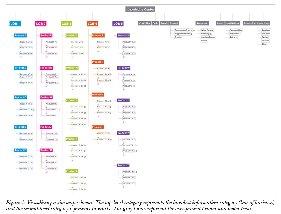
In online documentation, the information architecture can be reflected in a site map. When thousands of documents from different solutions and versions are migrated to an online format, it’s crucial to have a logical site map that classifies information in a hierarchy, from the most general category to the most specific. The site map depicts the exact structure of the documentation site with major and minor branches reflecting information categories, showing where individual pages reside within that structure.
Using a mind mapping tool such as MindManager or XMind to map the taxonomy, the information architecture of a documentation site can be visualized as a schema. Technical communicators can visualize information as hierarchical building blocks when they add major and minor branches to the schema. The structure of this collection of major and minor branches forms the documentation site map.
The schema can be expanded or collapsed to view details of the branches. It can also be converted to an HTML or CSV format and imported into the site as the actual classification framework. The documentation site’s hierarchy is built according to the structure of the imported file.
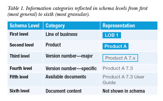 In this case study, the documentation site consists of six schema levels, from a line of business as the highest (or most general) level to document content as the lowest (or most granular) level.
Product Documentation Schema
In a documentation site map, most of the schema consists of product documentation. The complexity of the product documentation schema depends on the type of products. For example, if products can be grouped together under a super-category, then they can be accessed via the parent level. If products cannot be grouped together, then they become the top level, or main gateway, to accessing the documentation.
Complexity also depends on the number of product versions. If the customer base uses a wide range of product versions, the site map schema must accommodate branches for all versions so that all relevant documentation can be accessed from the site.
Six levels or information categories were visualized in this site map schema:
- First level—line of business. This is the broadest category of information. If we visualize information as building blocks, the lines of business form the top row (see Figure 1).
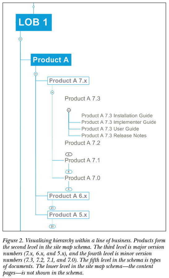
- Second level—product. All products are arranged as building blocks under their parent line of business. In this site map schema, each product can belong to only one line of business.
- Third level—major version number. The third level of the site map schema reflects major version categories, such as 7.x, 6.x, and 5.x. The major category—for example, 7.x—includes all versions within that family.
- Fourth level—specific version number. This level contains minor version categories, such as 7.3, 7.2, and 7.1 (see Figure 2).
- Fifth level—available documents. All documents relevant to a specific version for a specific product, such as Installation Guide, Implementer Guide, and User Guide, are reflected in the fifth level of the site map schema.
- Sixth level—content of document. This is the most granular level of the site map schema and represents the actual document content screen by screen. The content level is not depicted in the site map schema since it is too detailed, but it is represented in the wireframe stage.
Although the hierarchy can contain several levels, if the information architecture is logical, users will easily learn how to navigate the site and know where to go next. Visualizing a comprehensive site map when planning an online documentation site helps to facilitate a positive user experience.
Support and Knowledge Links
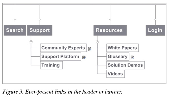
In the site map schema, the gray elements represent links that are always present in the header and footer. The header links connect users to external support, training, and knowledge sites that go beyond specific product documentation (see Figure 3).
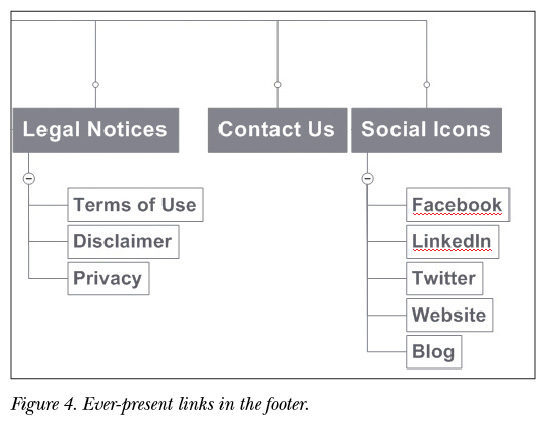
The footer links are standard for a company website: legal notices, contact information for global offices, and icons linking to social media channels (see Figure 4). Placing the header and footer links in the site map schema helps technical communicators envision what type of information will be available to users on every page in the documentation site.
Wireframing the Layout of a Documentation Site
Once the site map has been mapped out as a schema containing all branches of the documentation hierarchy, the next step is to consider how those branches will appear as pages in a website.
Planning the layout of website pages involves wireframing or using a grid that divides a page into multiple columns and rows. In the wireframing stage, technical communicators can chunk information as elements and place them in a balanced way within the grid.
For the wireframe design in this example, a 1,024 x 768 pixel-width screen was divided into 16 equal units. In a documentation site, the actual grid is invisible, but it’s a critical tool in the design process since it helps us visualize where all the elements will sit on each page.
As Ellen Lupton said, one of the most humane functions of design is “to help readers avoid reading.” The aim of a wireframe design is to create a layout that enables users to find what they’re looking for quickly and easily. To that end, the wireframe design includes the following visual elements:
- Navigation tiles. Visible tiles reflect high-level categories that are meaningful to the user, so the user knows where to find specific information. The logic behind these categories is the hierarchy of the site map schema, so that the first and second levels are depicted in navigation tiles.
- White space. In an age of “too much information,” the last thing users want is to be visually bombarded. Don’t underestimate the power of white space. Using white space generously around the different information elements in the wireframe gives them prominence and helps draw attention to them. If documentation webpages are very dense with information, it requires more effort to scan, and find, what you’re looking for. Trying to find information on websites that don’t have much white space can be like looking for a needle in a haystack.
- Search bar with filters. Featured in the center of the top part of the screen, the search bar is very prominent, so users can easily search from any page.
- Breadcrumbs. The webpage trail provides context so users can understand how the currently viewed page relates to the bigger picture. If a document is accessed from the navigation tiles, the breadcrumbs show, for example, the line of business and the product.
Wireframe for the First Level in the Schema: Line of Business
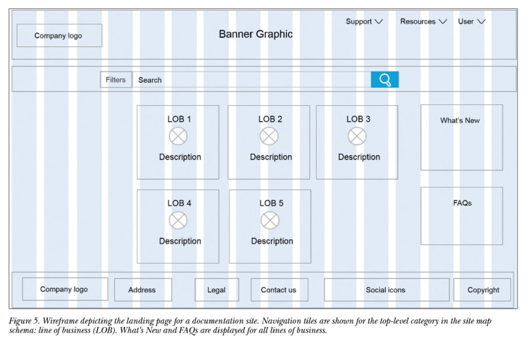
When we define an online-information layout, each screen represents a different level in the hierarchy. For example, the documentation site’s landing page represents the top-level category in the schema—line of business—where each line of business is depicted with a navigation tile (see Figure 5).
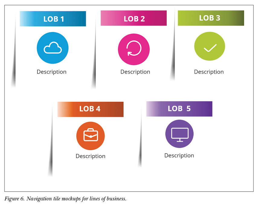
Navigation tiles for lines of business include the name, a short description, and a unique icon (see mockups in Figure 6). The short description provides context to users, especially new customers. Once customers are familiar with the documentation site, the line of business icon is recognizable at a glance.
What’s New and FAQs are displayed for all lines of business. The information is dynamic; it’s constantly updated with an expiration date to reflect only current information.
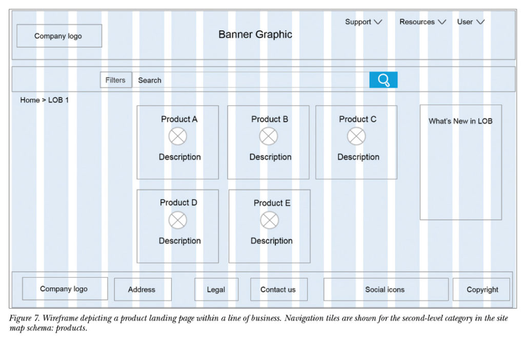
Wireframe for the Second Level in the Schema: Product
When users click a line of business navigation tile, they enter the second level of the schema: The product page for that specific line of business. Each product is depicted with a navigation tile. These navigation tiles reflect the second-level branches of the site map schema (see Figure 7).
What’s New is displayed for all products within a specific line of business.
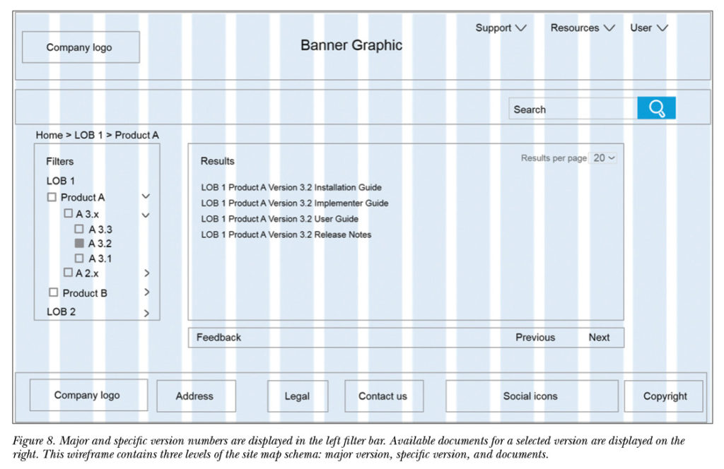
Wireframe for the Third through Fifth Levels in the Schema: Version Numbers and Documents
When users are within the product category, the version hierarchy is displayed in the filter sidebar on the left. Using a dynamic filter bar allows three levels of the site map schema to be displayed on the same page: major and specific version numbers are displayed on the left, whereas available documents for the selected version are displayed on the right (see Figure 8).
The major version category (for example, 3.x) represents the third level in the site map schema and includes all versions released under 3.x.
Specific versions (for example, 3.3, 3.2, and 3.1) represent the fourth level in the site map schema and can be displayed collectively or individually. When users click on the relevant version, the fifth level in the hierarchy is displayed on the right: types of documents, such as the Installation Guide, Implementer Guide, and User Guide.
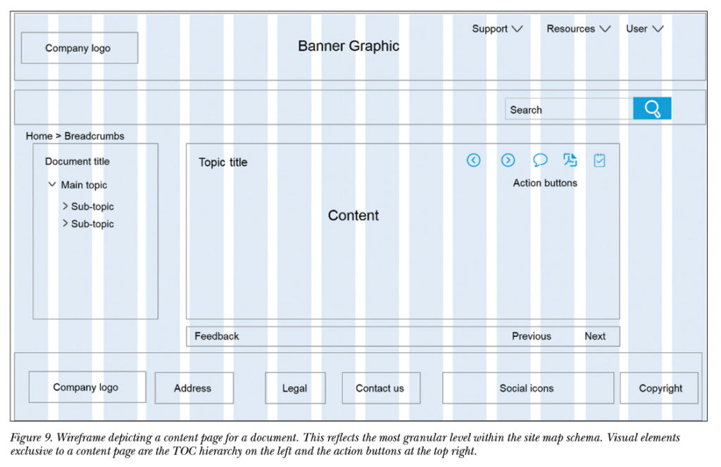
Wireframe for the Sixth Level in the Schema: Content
After users click a specific document name, they enter a content page, which represents the lowest or most granular level in the site map hierarchy. Every content page is typically a single topic, and the topics within a document are arranged in their own hierarchy, as reflected in the navigation bar or table of contents (see Figure 9).
To facilitate online reading, the content width of a document page should not span the entire screen. If the line length is too long, it’s difficult for users to find the next line, and they can end up reading the same line twice. In this wireframe design for desktop, the content width is about two-thirds of the entire grid width. In HTML, this translates to about 100 characters per line.
The visual elements exclusive to a content page are as follows:
- Navigation bar (TOC). The table of contents is displayed to the left of any content page and is dynamically synchronized with the currently displayed page. The topic displayed in the content pane is highlighted using a bold font in the table of contents. The navigation bar displays the hierarchy of all topics in a single document and facilitates a bird’s-eye view of an entire document.
- Action buttons. Displayed at the top-right of every content page, action buttons allow users to take content and drag it to their personal domain. As Cameron Koczon argues, the ability to pull relevant content means that content is orbital and more user-oriented. These action buttons allow users to:
- Jump to previous and next topics
- Send user feedback
- Generate their own PDFs from selected topics
- Make customized document collections
- Monitor document updates via a watch list
Leveraging Visual Content
When it comes to reading documentation, users seldom have patience for lengthy descriptions or too much information. They scan documentation to find what they’re looking for, and often latch onto graphics as their main reference point, because people process graphics faster than text.
The brain can identify images seen for as little as 13 milliseconds (ms). That’s superfast compared to the average time it takes to process a letter (476 ms) or a word (441 ms), according to work by Mary Potter and her colleagues.
 Signposting content with visual cues helps users more easily scan documentation to find what they need and avoid reading, which requires cognitive effort.
In online documentation, the following visual cues help users to scan text and avoid reading:
- Fonts. Different fonts are used to differentiate body text from code text, for example, and to obtain maximum clarity and legibility.
- Note icons. Specialized types of text are tagged with an icon and label to facilitate rapid processing.
- Infographics. Vector graphics and icons, together with text, help simplify complex information so it’s understood at a glance.
Fonts
The choice of fonts for an online documentation site is significant when the text must be clear, readable, and legible, and font sizes and line spacing vary according to device (see Table 2).
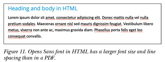
Online, it’s easier for users to read sans serif typefaces—fonts that don’t have extra embellishments on the letters—rather than serif typefaces. Sans serif typefaces are cleaner, leaner, and have excellent legibility. Examples of sans serif fonts include Open Sans, Verdana, and Futura. Open Sans, designed by Steve Matteson, is optimized for print, web, and mobile interfaces, and has extra kerning (space) between characters, making it easy to read.
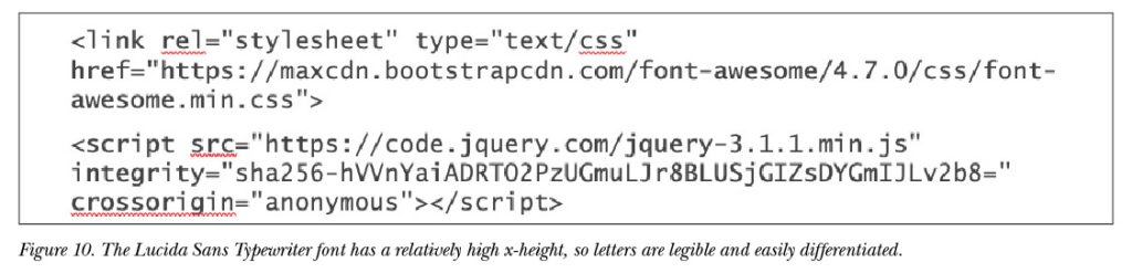
To differentiate regular body text from code, consider using a special font for code that is optimized for the web, such as Lucida Sans Typewriter (see Figure 10). The relatively large x-height of Lucida Sans Typewriter makes it easier to read than traditional code typefaces such as Courier.
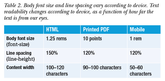
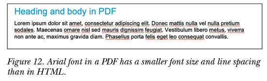
Users view online documentation differently than printed PDFs, since a desktop is usually farther from the eyes than a printed page. For that reason, font sizes in online documentation must be larger than standard sizes in print. A font size that looks good in print will look too small on a desktop. See Figures 11 and 12 for examples of HTML and PDF font size and line spacing.
Note Icons
Users rarely read an entire page of text, but instead scan to find what they’re looking for. Some traditional ways of breaking up text into smaller chunks are to use headings, bulleted and numbered lists, and tables. As documentation evolves into an online format, the use of visual signposting has become more common, especially in note icons.
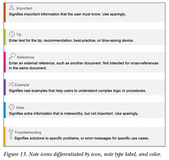
Assigning different icons to different note styles helps users differentiate between types of notes, such as Note, Important, Example, Reference, Tip, and Troubleshooting.
Each note type has three components:
- Icon. The note type is visually represented by a symbol (signifier).
- Label. A text label (signified) indicates the note name. Providing the icon name next to the icon helps reduce ambiguity about the icon’s meaning.
- Color. A unique color is assigned to each note type.
 These three identifiers—icon, label, and color—work together to facilitate easy scanning of blocks of text, as illustrated in Figure 13.
Infographics
End-user documentation often contains technical information that’s hard to understand, especially when the text is lengthy and complex. An infographic is meant to represent information visually to tell a story. A good infographic simplifies complex information so that users can understand it at a glance.
There is also evidence that images attract more attention than words. Using eye-tracking equipment that produces heat maps, the SEO company Moz studied users as they viewed Google search results. The aggregated heat map in Figure 14 shows that a search result with an image attracted much more attention (yellow area) than a search result without an image (red area).
In end-user documentation, this means that readers are likely to focus on available infographics—and not on text—as their main reference point.
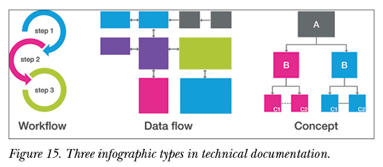
Three main types of infographics are used in technical communication (see Figure 15).
- Workflow, a bird’s-eye view of an ordered procedure that spans several topics, such as how to install a solution.
- Data flow, a simplified representation of information flow, such as architecture.
- Concept, a visual representation of a functionality or concept.
When technical communicators convey complex processes or flows as infographics, they help readers understand information at a glance and improve the overall customer experience.

Here are some general guidelines that help leverage infographics in online documentation:
- Display infographics in their full size. It’s not recommended to show images as thumbnails, since this requires extra effort from users to click an image to see it clearly. Users should be able to process an infographic at first glance.
- Place infographics at the top half of the screen. Eye-tracking studies show this is where people focus most of their attention.
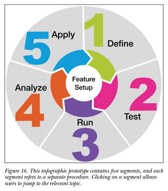
- Create interactive graphics (see Figure 16) that allow users to jump to relevant topics from the infographic. For example, an infographic with a numbered procedure can link each number to the topic that describes that procedure. Tools such as Flare allow technical communicators to create interactive graphics with an image map.
Infographics do not replace text altogether; they complement the text so users can understand information at a glance. As documentation becomes more visual in an online medium, infographics will become more important as vehicles of information.
Conclusion
Online documentation is a more visual and interactive medium than traditional PDFs, and as such, technical communicators can leverage visual skills to structure and convey information in a more visual way. In an information era, the role of technical communicators is to help users find the information they’re looking for and understand the context—not to overload users with too much information, whose context is not clear.
As visual information is easier to process than text, technical communicators can offer a better user experience by providing information visually. This view of visual documentation begins in the site map schema stage, continues throughout wireframing, and is completed online with signposted content and infographics that can be understood at a glance.
Sara Stein (sara.stein@niceactimize.com) is a senior technical writer and infographics expert at NICE Ltd. She has worked for 20 years writing and designing documentation for the Israeli high-tech industry, with a focus on visual documentation and infographics for the internet.
Note: The opinions expressed herein are the author’s and are not expressed by NICE Ltd.
 References
Koczon, Cameron. 2011. “Orbital Content.” A List Apart, 19 April 2011, http://alistapart.com/article/orbital-content.
Lupton, Ellen. 2014. Type on Screen: A Critical Guide for Designers, Writers, Developers, and Students. New York: Princeton
Architectural Press.
Manovich, Lev. 2001. The Language of New Media, Cambridge: MIT Press.
Potter, Mary C., Brad Wyble, Carl Erick Hagmann, and Emily S. McCourt. 2014. “Detecting Meaning in RSVP at 13 Ms Per Picture.” Attention, Perception, & Psychophysics 76, no. 2: 270–279.
Wurman, Richard Saul. 1996. Information Architects. Ann Arbor, MI: University of Michigan.