Useful guidelines to create a design system that will ensure information delivery is a success.
By Nikki Arnell
A clear design system must be formulated before consistently implementing it into any information visualization. Infographics are quickly replacing long texts to explain complex information in an abstract visual manner clearly; however, efficient message delivery can be impeded by seemingly insignificant design choices. The continuity provided by a set design system provides a consistent visual framework that decreases the reader’s cognitive efforts to comprehend and retain the presented information. This article provides guidelines easily addressed to create a design system and ensure information delivery is a success.
The Importance of a Consistent System of Shape, Space, and Color
User interface/user experience (UI/UX) designers and developers know visual consistency increases a product’s learnability. The font sizes, button design, and color system – all using predictable placement and uniform padding in a hierarchical nature – are fundamental before any product is released for testing. Though information design does not have the same physical interaction demands as an application (app), the human behavioral rules remain the same.
Information visualization is the graphical representation of abstract data. When presenting each element of a communication consistently, the reader—or user—does not need to learn anything about the artifact other than the key communication differences. The necessity of reducing cognitive barriers must not be ignored.
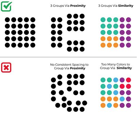
Consistent color and typefaces are easy to understand when creating a system. Gestalt studies of visual perception prove that space is just as important as shape to simplify a complex visual world. Humans seek patterns to group components (Figure 1).
Use Visual Hierarchy to Encourage and Control Message Delivery
No matter how much one might wish a reader would spend hours reading every word on the page and exploring each element of an infographic, human nature is first to skim. If the message and its contents are not easily grasped, most readers will proceed hesitantly. By using a clear hierarchy to prioritize information into visual groups with a consistent system, readers will quickly grasp the communication’s structure and engage.
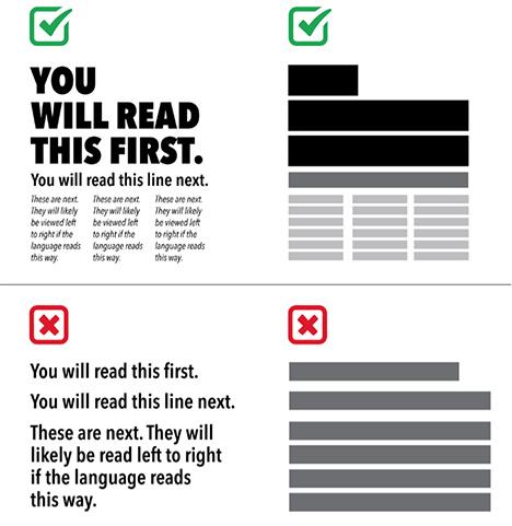
Fewer than three levels results in no clear hierarchy; however, every level exceeding three degrades the organizational structure. It is easy to understand in paragraphs of text, as shown in Figure 2. Viewers must be able to easily view the consistent chunks of information, or it will compromise readability.
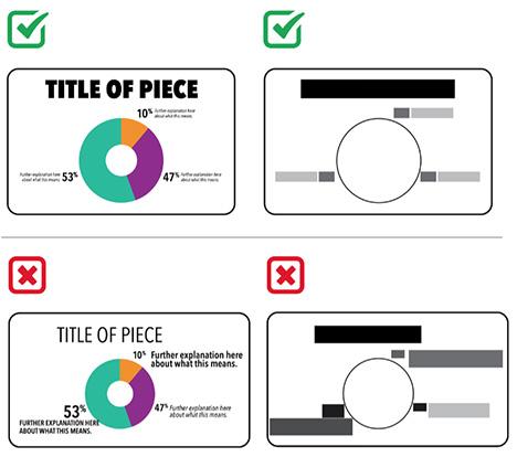
It is just as important to use consistent hierarchical presentation in an infographic. If there are too many levels, no hierarchy appears. Likewise, if the levels are not treated consistently, there is no systematic hierarchy (Figure 3).
The Importance of Typographic Choices
If one must choose only three fonts to signify hierarchy, restraint in selection is also necessary. Choosing one sans-serif typeface, like Arial, Helvetica, Montserrat, or Verdana, is the preferred action. These are named sans-serifs because they are without serifs.
Serifs, like Times New Roman, Georgia, Baskerville, and Courier, are named this for the little hooks at the ends of letter strokes. Though serifs might guide reading between letters slightly on the printed page, this power is reduced on-screen. Serif faces are also not as streamlined as sans-serifs. All scripts or other alternative typefaces should be avoided completely. Regardless of trendy templates one might find, typefaces that display obvious remnants of handwriting or individuality provide a barrier when presenting abstract information (Figure 4).
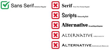
Once a sans-serif typeface is chosen, only explore its family members, sizes, and (if available) color for further hierarchical levels. Typeface families usually include at least a Regular, Bold, and Italic font. Though italics of serif typefaces originally copied handwriting, sans-serif italics have no obvious remnants.
Another way to create a hierarchical level in one typeface family is to use ALL CAPITAL LETTERS for a title but proceed cautiously. Though the rectangular, constant shape it presents is aesthetically pleasing to designers, ALL CAPS IS YELLING AT THE READER (Figure 5). Using all capital letters are also harder to read than text using lowercase, especially for those with reading disabilities.

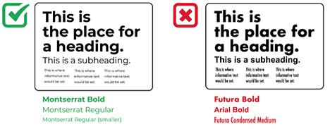
Do not choose any other sans-serif typefaces to use in one design system. For example, Futura and Arial should not be used in the same piece. The general shapes of sans serifs are not different enough and the use of both in one piece will appear slightly off (Figure 6).
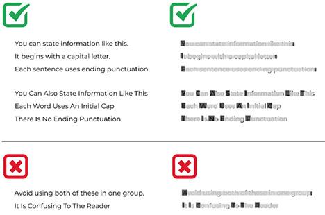
Finally, awareness of patterns created by shape is important when choosing one consistent treatment of label text. Readers are accustomed to either of the following. Choose one for your system, then be consistent (Figure 7).
Pay Attention to Space as Much as Shape
The pattern-seeking behavior to group by similarity explains the need for a consistent hierarchical system of typeface treatment. Grouping by proximity in space is the next step once a visual hierarchy is established.
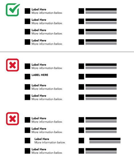
Text and objects placed close to each other become chunks of information. Then the reader views the communication as a simplified element made of fewer “chunks” – versus an overwhelming amount of information – that invites engagement and focuses the transmission (Figure 8).
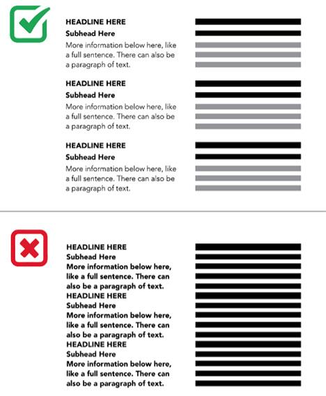
Conversely, the grouping breaks when an item is not located near others. This causes unneeded distraction in otherwise streamlined information visualization, as shown in this example in Figure 9 that uses labels like an infographic’s key.
Use Color Wisely
When color is available, use fewer hues that work to empower each other. Using and understanding a color wheel is an easy way to apply powerful color combinations, like complementary, triadic, and analogous color schemes (Figure 10).
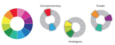
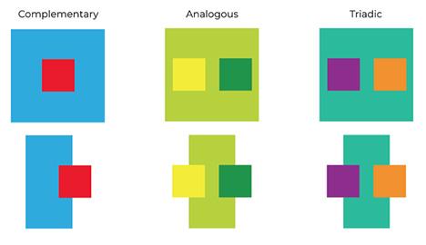
Complementary colors exist opposite each other on the wheel and provide the most powerful differentiation. This is key when presenting different ideas or concepts. However, these colors should not be placed on each other because they will “vibrate” and be painful or impossible to read. Groups of colors next to each other on the color wheel are called analogous. These will group via similarity. The slight differences may be perfect for portraying a group of separate but related elements, or they may be too subtle for clear communication. Triadic colors often create the most successful combination (Figure 11).
Additionally, one must never assume that color symbolism will be understood the same across cultures. This is especially true when challenged with communicating an already abstract idea. Finding any “Color Symbolism” chart online is pointless unless the audience is clearly defined. For example, green can usually represent nature and conservation elements easily; however, avoid using it to symbolize finances. America is one of a few countries that use paper money in only this color. Red is another tricky hue. While much of western Europe and America find the color to symbolize intensity, aggression, power, sex, and danger, red is a positive symbol of good luck and joy in many eastern cultures. For example, it is deeply intertwined with matrimonial traditions in India and China.
Conclusion
The small amount of time it takes to decide on a consistent design system, as explained in this article, before creating any information visualization is worthwhile. Then, one must employ this system consistently throughout the piece, ensuring that space is as attended to as shape (Figure 12).
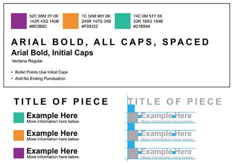
When communicating an abstract concept and/or complex data in information visualization, this easy proactive effort of design system creation provides a consistent visual framework that decreases the reader’s cognitive efforts to comprehend and retain the information presented. Overall, it is a minimal investment of time with maximum rewards.
References
Arnell, Nicole L. “Increasing Cultural Awareness for Effective Global Communication via Graphic Design Practice and Instruction.” The International Journal of Visual Design 13, no. 1 (April 22, 2019): 27–40. https://doi.org/10.18848/2325-1581/cgp.
Bustamante, Nathalia. What is Gestalt Psychology? Simply Psychology, Last accessed November 15, 2021. https://www.simplypsychology.org/what-is-gestalt-psychology.html.
Lang, Alexander. “Aesthetics in Information Visualization.” Media Informatics and Human-Computer Interaction Groups. Ludwig Maximilian University of Munich, 2009.
Nikolov, Anton. “Design Principle: Consistency Design Principle: Consistency – The Most Known and Most Fragile Design Principle.” Medium. UX Collective, Last accessed May 5, 2020. https://uxdesign.cc/design-principle-consistency-6b0cf7e7339f.
Wong, Euphemia. “Principle of Consistency and Standards in User Interface Design.” Interaction Design Foundation, Last accessed February 2, 2021. https://www.interaction-design.org/literature/article/principle-of-consistency-and-standards-in-user-interface-design.

An obsession with advertising led Nikki Arnell (www.nikkiarnell.com; narnell@astate.edu) first to a decade as an Art Director. She then earned her MFA and did a career pivot to academia. Now a tenured professor in a college of art, Arnell mixes traditional research and design with a focus on graphic design history.

