By Candice A. Welhausen
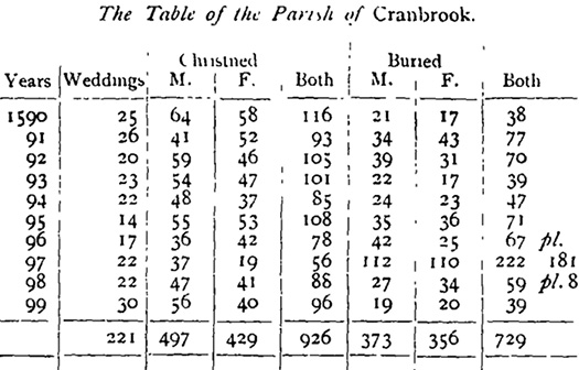
Visual representations of quantitative information are commonly used to show relationships among health-related data and to achieve particular communication objectives. In the late seventeenth century, for instance, Captain John Graunt constructed the first life expectancy tables from mortality data collected by London officials (see Figure 1). His hope was “some other uses might be made” from the information. His was one of the first steps toward using visuals to convey health and medical information to different audiences.
Historical Examples
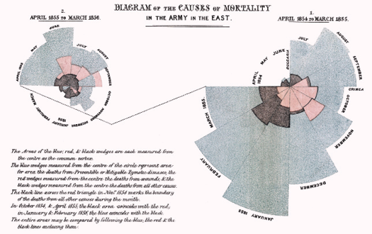
In the mid-nineteenth century, two important events happened in relation to visualizing medical information. First, Florence Nightingale, the founder of modern nursing, created rose diagrams to convey public health information. Later, the early epidemiologist John Snow created a map to examine the location of cholera cases during an epidemic. The idea behind both creations was that such images could advance new theories about the spread of disease. More specifically, Nightingale sought to visually demonstrate that unsanitary hospital conditions had caused more soldier deaths during the Crimean War than war-related injuries (see Figure 2).
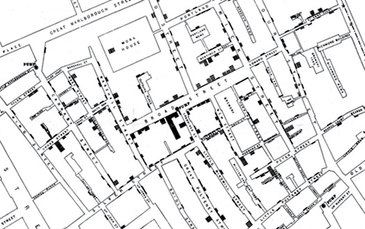
Snow, on the other hand, used his map to argue that cholera was a water-borne disease (contrary to common belief at the time). He did so, in part, by using a visual to document the clustering of deaths during one of London’s worst cholera outbreaks (see Figure 3).
From our twenty-first century perspective, these historical examples may seem rudimentary. Indeed, early creators of data visualizations did not have the benefit of sophisticated data analysis packages like SAS, a statistics program commonly used to create visuals in health-related fields today. The basic purpose of visualizing health data, however, remains unchanged. It still involves condensing quantitative medical information into abstract visual representations that can then be used to explore possible trends and patterns. The construction of these historically significant graphics thus illustrates several key design considerations that are still applicable today.
Determine the Visual Relationships You Want to Emphasize
…And what your readers/viewers care about for the particular situation at hand. The creators of early data visualizations mentioned above constructed their data into a particular visual metaphor or form—table, diagram, and map, respectively. They did this to emphasize select relationships among health-related variables they wanted to display. More specifically, Graunt’s tables enabled readers/viewers to compare individual quantities within a large collection of quantitative information. Nightingale’s diagrams invited viewers to make select comparisons. And Snow’s map showed spatial relationships among particular variables—more specifically, he used visuals to establish proximity between the location of cholera deaths during the outbreak and the Broad Street pump, the water source he believed was the source of the disease.
Today’s technical communicators can learn from such examples. The creation of each of these graphics demonstrates the importance of determining the relationship(s) you want to create among variables—for example, temporal, comparative, spatial—and the specific visual genre that will convey these relationships—line graph, bar chart, map—to viewers.
Design the Visual and the Written Elements of Your Graphic Together
The genre you choose for the data you are working with will signal the type of visual relationship being conveyed, but viewers do not construct meaning from genre alone. Rather, the accompanying text (title, labels, captions) is equally important. More specifically, the visual information in your graphic (lines, shapes, shading) conveys the relationship among the data shown (for example, line graphs show trends over time) while the textual content describes those variables.
Looking at Graunt’s work today, we likely recognize his grid layout as a table, and Snow’s bird’s-eye perspective is still routinely used in contemporary maps. Indeed, visual communication researcher Charles Kostelnick has argued that viewers understand these commonly used forms today, because we have become accustomed to their design conventions. Nightingale’s diagrams, on the other hand, may be harder for us to immediately interpret, because the visual form she used is not as conventional now.
If we consider just the forms of the images themselves without the accompanying explanatory text, something becomes obvious. The labels in Graunt’s columns, the short paragraphs in Nightingale’s diagram, and the caption under Snow’s map are essential to discerning the full meaning of each graphic. Based on these examples, technical communicators should consider the following:
- The visual relationships they want to convey and the genre usually used to show that relationship; and
- The language they will use in the graphic (title, labels, captions) to describe the visual relationships the graphic shows.
Both are central to effective communication via data visualizations when sharing health and medical information.
Create a Clean Design Style
Over the last few decades, The New York Times (NYT) has established a reputation for creating appealing data visualizations. These visuals often use particular design choices—thin sans serif typefaces, minimal labeling, strategic use of color. This approach creates a clean and streamlined appearance. While Graunt, Nightingale, and Snow had very limited typeface choices, Nightingale and Snow used some of these same strategies. More specifically, both used minimal labeling in their graphics, while Nightingale also used color to show each variable (for example, shades of pink, brown, and blue).
Today’s technical communicators can also create a clean design style by choosing sans serif typefaces, selectively labeling data points, and calling attention to select variables through color choices. To illustrate, the fictional line graph in Figure 4 mimics the design choices of many data visualizations created by the NYT. More specifically, the x and y axes use the thin, sans serif typeface Cordia New. Visual clutter is minimized through selective labelling of the y axis (increments of 30). Red is used to call attention to 2017, while shades of grey are used to downplay the data points for 2016 and 2018.
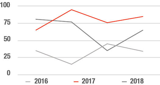
Color choice is a particularly powerful design decision, especially in data visualizations of medical and health-related information. This is because color signals how alarmed viewers should be by the information presented. More specifically, warm colors, like red, tend to be perceived as anxiety-invoking and urgent. Conversely, viewers tend to perceive cool colors, like blue, as reassuring and calming. Greyscale and shades of brown tend to be less noticeable and thus likely to be perceived as more neutral by individuals.
As mentioned, Figure 4 does not show real data. However, it is important to point out that the red line in this graphic might not be appropriate in some situations, such as communicating quantitative information about outbreaks of certain infectious and communicable diseases (such as Ebola). More specifically, red may overly alarm viewers. As a result, technical communicators might want to avoid using red in situations where the reader might already be highly fearful and anxious.
At the same time, red can also be used to draw attention to the seriousness of a particular health-related situation. For example, many of the graphics in the NYT’s coverage of deaths from the opioid epidemic (see Resources) often uses the visual strategy depicted in Figure 4. Technical communicators should determine the particular emotional response they want to invoke using color, and select their design palate accordingly. Specifically, consider if the objective is to increase viewers’ perception of alarm or to convey reassurance. Making this choice can allow technical communicators to convey sensitive and essential information about health risks in ways that minimize fear responses and panic.
Final Thoughts
Information designer Albert Cairo has argued data visualizations should allow viewers to explore data. This means design choices should be complex to a certain extent. Indeed, all the graphics discussed here require viewers to take a closer look in order to fully consider the information being shown. Ultimately, data visualizations should enable readers to understand and make decisions about data.
Resources
Cairo, Alberto. The Functional Art. An Introduction to Information Graphics and Visualization. New Riders: Berkeley, CA, 2013.
Johnson, Steven. The Ghost Map: The Story of London’s Most Terrifying Epidemic—and How It Changed Science, Cities, and the Modern World. Penguin Books: New York, NY, 2007.
Katz, Josh. “Short Answers to Hard Questions About the Opioid Crisis.” New York Times. 10 August 2017. https://www.nytimes.com/interactive/2017/08/03/upshot/opioid-drug-overdose-epidemic.html.
Kostelnick, Charles. “Melting-Pot Ideology, Modernist Aesthetics, and the Emergence of Graphical Conventions: The Statistical Atlases of the United States, 1874–1925.” Defining Visual Rhetorics. Mahwah, NJ: Lawrence Erlbaum Associates, 2004, 215–242.
CANDICE A. WELHAUSEN (caw0103@auburn.edu) is an Assistant Professor of Technical and Professional Communication at Auburn University. Before becoming an academic, she was a Technical Writer/Editor at the University of New Mexico Health Sciences Center in the department formerly known as Epidemiology and Cancer Control.


The figure 4 y-axis is labeled in increments of 25, not 30.