By Aleshia Jefferson, STC Member
Move beyond the body of the document and focus on continuous improvement
In 2016, my company acquired the Microsoft Office 365 Enterprise Cloud software package along with Microsoft Power tools and other Microsoft products. With this came a push from my company’s information technology (IT) department to have all workers house all business-related documentation in SharePoint Online (SP). Communications that followed insisted that within two years, all legacy software would no longer be supported and that all site owners were to build sites using only out-of-the-box (OOB) SP features.
At the time, I was part of the company’s learning and development (L&D) department, and worked with project managers, instructional designers, technical content writers (TCWs), and managers. My work segment was responsible for writing, storing, and publishing clinical and medical standard operating procedures (SOPs) and accompanying job aids, which were used by medical and clinical managers, front-line-staff, and some third-party vendors to support our members.
Prior to the upgrade, we were using a SharePoint 2010 site that had been haphazardly built by a single person who did more harm than good by customizing the site without gathering customer or team input. When we switched to SP Online (2016 version), again, instead of collaborating with the team and end-users, the same person customized the main library that we used to create, house, and publish artifacts.
Within the next two years, the owner who had customized features in our site left the company, and all customized interoperability and maintenance of the site rested on me to unravel, as there were no policies and procedures (P&Ps) written about using the customer-facing components or updating the backend of the site. I had only used the on-premise version of SP 2007, and I was not fully familiar with SP Online. Our team was reorganized, as well, and my work group became a team of three TCWs plus a manager. We were shuffled to the Quality & Accreditation department along with more than 1,200 SOPs.
The Task
My small team became responsible for planning, designing, writing, housing, publishing, and archiving SOPs. We had more than 1,200 SOPs, which included those that were outdated, duplicated, and mid-review. All SOPs (regardless of state) needed to be transitioned from L&D to the three TCWs. What’s more, these artifacts were written to support multiple internal lines of business across several states and varying product lines.
Our manager wanted us to reconstruct the site (that we now shared with the internal training department) and put in place governance rules so that our team could work more efficiently. At the time, the specific goals for our team were to:
- Reduce the number of SOPs to less than 100.
- Remove redundant procedures.
- Provide content that focused on treatment and handing the member from a business operations perspective.
- Add a set of outcomes per procedure to enhance performance.
- Make the SOPs system agnostic (i.e., abandon all software tools and system callouts along with instructions for using the tool or system).
- Reconstruct many of the process diagrams or images, because the shapes used were not consistent across the lot.
The effort to make these changes would take longer than a year — especially with only three people — and the effort would be monumental. And early in the process, we lost our manager. Regardless, as a team of three TCWs, we took ownership of the challenge and the solution, and we prevailed.
In this article, I focus on how I was able to use Microsoft’s Power BI platform to tell our story and showcase our efforts after building out the solution, including the supporting processes, by presenting qualitative and quantitative information to the associate vice president (AVP) of our department.
Understanding Metrics and Visualizing Results
I am not a data analyst or a data engineer, but I had to figure out, ask questions, and study materials about gathering data to gain results. As technical writers, we manage mounds of documentation data, but while in school technical writers receive little or no guidance for learning how to derive metrics for their work or directly for documentation. What happens when we start to think about documentation metrics from the perspective of customer service, customer experience, performance, operations, or from the point of view of supply chain management? The questions we ask about our documentation change dramatically.
For written, end-user documentation, in the past, the typical data collected has been quantitative data, using Likert scales, where writers ask surface-level questions about the document itself. For example, they might ask:
- Is the content readable?
- Does the document list the correct version number?
- Is the title appropriate?
- Is the information clear to the reader or user?
- Is the document grammatically correct?
- Is the style consistent?
- Can the user find the document?
As technical writers, it is time for us to move beyond creating metrics about what is in the body of the document to defining those metrics that move us toward continuous improvement, so we can present our work as invaluable to company leaders.
To display a visual representation of the data related to our work, I used the Power BI. Because the TCWs reported directly to an AVP, there was no middle manager between us, so we needed to tell our story to present what we did at a very high level and provide facts and content designed to enable good business decisions.
We also needed to pull consistent data based on our work. In the past, we incorrectly reported counts of our documents as a result of gathering this information manually and populating an excel spreadsheet. With Power BI, we could automatically pull the data from our SharePoint sites, which would provide more accurate data and a clearer picture of our work (as individuals and as a team).
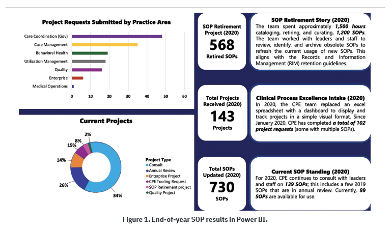
I had to create a visual for the AVP to present to other leaders on our behalf, and I was not only able to pull quantitative data, but I was also able to tell a few stories (qualitative data). Figure 1 shows that story.
The AVP wanted to be able to provide a big picture summary of our work, and the additional request was to keep it simple. I was asked, “What is your key performance indicator (KPI)? Can I see a burndown?” This language was familiar, but at the same time foreign; I had only heard these terms during meetings where managers or project managers presented data and discussed strategy. I did not know what I was up against, but I knew I needed to:
- Understand the company’s strategic goals and how they cascaded to my work.
- Know, or find out, what my manager wanted to report to the leadership to make a statement about how the team was achieving the business objectives.
I learned that when creating a KPI, I needed to define a targeted, measurable value to show how successful a team could be at accomplishing the business objective. The business objective for our team was to drive results, and one goal was to automate processes. Our KPI was to “decrease 1,200 SOPs.” I turned this into a supporting metric by making it a more specific goal, which my team had already stated, and that was to “decrease 1,200 SOPs to less than 100.” Now, to make this SMART, we set a deadline for the end of the year (e.g., “decrease 1,200 SOPs to less than 100 by December 31, 2020”), creating a SMART goal and a KPI to present to management.
I suggested to the team that we look at the whole picture regarding the SOPs, separate the old from the new, and not try to update all 1,200 SOPs. As a result of that thinking:
- 568 of the SOPs could be immediately archived; they were created before 2019.
- Any SOPs published in 2019 or 2020, or were in progress, could be reviewed for decreasing to 100.
This brought the number from 1,200 to 632 immediately, and instead of a single overwhelming project, we had two more manageable projects.
Just after separating from L&D, I created an archive library where I checked for appropriate tagging, but I needed to ensure that every file had been opened and the effective, approved, and published date columns were populated to match the columns in SP. My coworkers volunteered to assist with this effort, and after we updated the dates in SP, I submitted a ticket to our IT department and asked them to duplicate the existing archive. When that was complete, I deleted all artifacts from the newly duplicated library marked 2018 and older, and I performed the same exercise with the existing (archive) library by removing any artifacts that were marked 2019 and newer.
Next, I listed the tools needed (i.e., the SP work request list, the SP publish library, the archive library, and Power BI). The work request list would be key for several items that needed to be counted or listed, and each submitted request would be considered a project, regardless of how many SOPs were attached or SOP titles were listed. I also listed a few questions that would help me capture metrics for a visual. These qualitative questions included:
- What was the cycle time between receiving a request and completing it?
- How much effort was spent, in hours, by each TCW to work through a project?
- How do I visualize a burndown of the 1,200 SOPs?
- How many total projects would we work on throughout the year?
- How can the set of 568 archived SOPs be reviewed and cleaned up, and the effort tracked?
Mid-year, we presented our project rationale and goals to our AVP, and I wanted to reiterate a condensed version of our story (qualitative) by pulling that information into Power BI. Therefore, the quantitative metrics that could be pulled from my sources and presented to the AVP were the:
- Number of project requests submitted by practice area
- Percentage of all work done by the team per project
- Number of actual SOPs retired based on the total of 1,200
- Total number of incoming projects being worked in addition to cleaning up the SOPs
- Total number of SOPs updated during the year
From a qualitative perspective, I could tell three stories in Power BI:
- The retirement project, the effort spent in hours, and how this benefited the company
- The process of manually entering data and activities into MS Excel, and moving the team to an automated process using Power BI
- Announcing whether the team had met the goal of reducing 1,200 SOPs to less than 100, and providing the new number of SOPs
With the help of my teammates, we were able to craft these three stories that summarized our year-long work activities, illustrated in the Power Bi dashboard that I submitted to our AVP (Figure 1). This was exactly what our AVP needed, and I was able to keep it simple and clean.
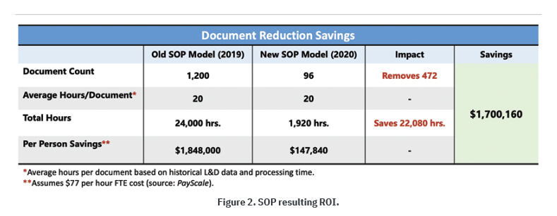
We were also able to discuss the return on investment (ROI). Our team had presented this information early at the start of the project, and I updated it to show the new ROI based on the reduction in SOPs.
We identified a case for an SOP ROI when we discovered that end users visiting the L&D site to search for SOPs might spend hours searching for an SOP. The search might pull multiple SOPs, some duplicates, some outdated, some belonging to a different practice area, but all having the same name as what they were seeking. In addition, the SOPs were incorrectly tagged within the library, these searches took time, wasting the hours being spent on locating and clarifying procedures in SOPs. To show this, we laid out the visual in Figure 2, showing an example of the resulting ROI and comparing it to the prior ROI before our team began handling SOPs.
The outcomes based on this model were possible increases in worker productivity, increases in worker knowledge for their practice area and procedures, reductions in audit errors, and reductions in worker turnover.
Ask Yourself
I would not have fully understood how to ask questions regarding end-user documentation metrics or know that I could tell a story using metrics had I not conducted research and attempted to remodel some of the information communicated in other business areas. I had also learned about metrics during my tenure as a project manager and by taking Six Sigma courses. By working through the kind of information needed to support a KPI, I had to think beyond asking surface-level questions associated with the body of documents. The journey was not easy, because information about gathering and displaying metrics for end-user documentation is rare.
I wanted to place more focus and emphasis on the people side of end-user documentation, formulating metrics based on experiences, so I immersed myself in seeking more insightful adaptations related to customer service, customer experience, performance, management, operations, or supply chain management. If we review metrics devised for other business areas and reassign them to fit end-user documentation, TCWs can begin to demonstrate impact, prioritize efforts, and show corporate leaders that TCWs add value to the bottom line.
As an industry, we should ask ourselves:
- Why do we continue to think of end-user technical documentation as a commonplace activity, where we create materials, if needed or as needed, to explain how or what to do?
- If we are not collecting, tracking, and continuously measuring how to improve end-user performance through documentation, how can we know where the gaps and errors are situated?
- How can we continue to improve and grow our knowledge and insight about documentation and its processes?
By asking the right questions, we can work toward meeting the business needs.
 Aleshia Jefferson (aleshia_l_jefferson@bcbsil.com) has been practicing professional technical writing for more than 25 years and is an STC member. She is currently responsible for curating standard operating procedures (SOPs) and finding ways to improve processes, sometimes by building software tools. Aleshia enjoys research, spending time with family, and solving puzzles.