doi.org/10.55177/tc131231
By Quan Zhou
abstract
Purpose: The communication of technical information is often susceptible to cognitive biases. Technical communicators need to understand cognitive biases and know how to tackle them accordingly. This article devises a framework of principles that provides technical communicators an operable affordance and a vocabulary to approach cognitive biases and to communicate empathetically.
Method: I review a vast body of literature in technical communication with a focus on problems caused by cognitive biases. This work reveals significant problems in information visualization that can provide for a nuanced discussion on cognitive biases in technical communication. Using these problems as a guide, I draw upon cognitive theories in how people use information, the prospect theory about how people make decisions, and the self-determination theory about how such decisions are influenced by the social context. I then assemble a framework of principles that illuminates the workings of cognitive biases. I extrapolate sample questions that technical communicators can use to examine cognitive biases in information visualization and technical communication.
Results: The framework of principles explains how cognitive biases affect technical communication. These principles are useful for gaining a deeper understanding of users from a cognitive bias perspective and optimizing for empathetic communication.
Conclusion: Technical communicators and users are prone to cognitive biases. The framework of principles, cognitive biases, and sample questions presented in this article provide technical communicators a new lens to examine their work and improve user experience.
Keywords: Cognitive biases, Technical communication, Information use, User experience, Users
Practitioner’s Takeaway
- Use the framework of principles to understand what triggers cognitive biases
- Articulate various cognitive biases and how they affect technical communicators and users
- Understand the role of cognitive biases in information visualization
- Ask effective questions to investigate, mitigate, and harness cognitive biases.
INTRODUCTION
We live in a world of complex information. How we interact with information and make sound judgments are of paramount importance to technical communicators. Yet, the human brain is not hardwired to cope with this dynamic array of information (Levitin, 2014). Much like our hunter-gatherer forbearers, we seek the shortest path and the least effort to digest information and solve problems. This is because the human attention span is limited, and memory is often inaccurate (Levitin, 2014). We allow unhelpful information to inundate our judgments, and we do not easily let go of established beliefs in the face of disconfirming evidence (Korteling et al., 2018). These phenomena are manifestations of cognitive biases: Mental shortcuts that cause humans to deviate from rational judgments (Kahneman, 2011). There is a vast body of scholarship on cognitive biases, originating in cognitive psychology (Kahneman, 2011) and growing in technical communication (Zhou, 2020).
Cognitive psychologists have yielded great insights into systems of human thinking (Kahneman, 2011; Levitin, 2014), cognitive illusions (Chabris & Simons, 2010), and the inner workings of the human brain (Bar, 2007; Korteling et al., 2018; Kosslyn et al., 2012). These insights provide a theoretical foundation that can guide technical communicators to understand cognitive biases in their work.
Because technical communication is deeply rooted in rhetoric, understanding cognition and cognitive biases are essential for effective and empathetic communication. Early technical communication work focused on the perceptual level of information use (Schultz & Spyridakis, 2004; Kostelnick & Roberts, 2010). It examined how people respond to stimuli, decode visual cues, and retain information. It adapted cognitive and psychological theories such as the Gestalt theory and those that explain pre-attentive processing and memory formation (Kostelnick & Roberts, 2010). This scholarship generated communication guidelines that are “universal” in the sense that they revolve around the physical and neurological traits all humans share. For this reason, however, it largely left out the lived experiences of the communicator and the user.
Technical communicators recognize that cognition can profoundly entangle a person’s experience, beliefs, and other contextual factors (Rawlins & Wilson, 2014; Verhulsdonck & Shalamova, 2019; Zhou, 2020). Some of their work explicitly addresses cognitive biases. Zhou (2020) introduces numerous cognitive biases that affect how users interact with technical and professional information. Verhulsdonck and Shalamova (2019) showed that designs infused with aspects of cognition can nudge users to adopt constructive behaviors. St. Amant (2017) showed how users’ mental models, culminated through their lived experiences, guide them to recognize rhetorical situations. Indeed, many areas in technical communication already tackle the tacit effects of cognitive biases, often without the formal use of relevant literature.
One such area heavily studied with regard to cognitive biases is information visualization (Ellis, 2018; Xiong, 2020; Harford, 2021; Wesslen et al., 2022). Information visualization embodies a vast network of technical communication practices. It requires complex rhetorical work (Rawlins & Wilson, 2014) and is prone to cognitive biases (Harford, 2021; Kostelnick, 2016). As such, information visualization presents a nuanced scene to understand cognitive biases in technical communication, and it is the focus of my discussion.
My work covers a broad scope of technical communication literature in major journals and professional sources, focusing on scholarship that directly or tacitly addresses problems that demand an understanding of cognitive biases. This review revealed significant interactions between information visualization and cognitive biases. I then used these problems to guide my search for insights into cognitive psychology that can, in turn, address challenges in technical communication. My work led me to assemble a framework of principles as an explainer of how cognitive biases occur. I then demonstrate how technical communicators can use this framework to analyze and alleviate problems caused by cognitive biases. As I do so, I extrapolate sample questions that can be useful for a broad range of technical communication work.
INFORMATION VISUALIZATION AND COGNITIVE BIASES
Scholars like Tufte (1983) and Kostelnick (2010, 2016) laid the foundation for the design of visual language and communication. Furthering their efforts, scholars expanded their study by encompassing the rhetorical decisions and the nuanced contexts in information visualization (Rawlins & Wilson, 2014). They have brought forth several issues that need to be addressed from a cognitive bias perspective.
Scholars converge on the notion that information visualizations are not a pure, objective representation of reality (Kosnelnick, 2016). They are stories (Lindgren, 2021), arguments (Roundtree, 2013), presences (Perelman & Olbrechts-Tyteca, 1969), inventions (Wolfe, 2015), and “humanizing displays” (Dragga & Voss, 2001). While the average user might be inclined to see visualizations as “objective facts” (Cairo, 2019), information visualizations reflect nuanced decisions made by data gatherers, analysts, technical communicators, and others throughout the production process from data gathering to visualization design (Rawlins & Wilson, 2014). In fact, by the time the data arrives at the desk of the technical communicator, it already embodies many subjective decisions made earlier. Such decisions could be as critical as whose data is included and what variables of the data are gathered (Harford, 2021). The user shares “authorial agency,” for they bring their own goals and backgrounds into their interaction with information visualizations (Rawlins & Wilson, 2014). These processes and interactions are susceptible to cognitive biases (Ellis, 2018; Harford, 2021).
Wolfe (2015) presented the notion of interpretive levels in visualizations, suggesting that data can focus on one interpretation while marginalizing other interpretations. Lindgren (2001) echoes this notion that visualizations often tell stories that are pivoted toward particular perspectives. Given its prevalence in everyday life, information visualization can cast a larger impact on private and public life that should not be underestimated (Cairo, 2019). Clearly, the need to consider cognitive biases in information visualization is meaningful and urgent. Effective visualizations must embody a contextual and dynamic understanding of the story they present and the cognitive biases at play (Kostelnick, 2016).
To understand this rhetorical nuance, scholars call for user involvement in evaluating visualizations (Stephens et al., 2015). But the means by which scholars seek to understand users do not often drill deep. Developing the kind of rhetorical acuteness so much called for requires technical communicators to listen to the users’ inner reasonings, reactions, and guiding principles of their actions (Young, 2015). That is to say that technical communicators should know what happens before and during the user’s interaction with a visualization. However, the user is often asked to provide feedback after interacting with a visualization (Stephens et al., 2015). They are typically asked to provide opinions about visualizations, confirm statements supplied by the researcher, or make design suggestions (Stephens et al., 2015). These approaches do not effectively uncover the user’s prior knowledge and background that could introduce cognitive biases. Nor can they incorporate such knowledge in the development of visualizations. My work tries to offer technical communicators ways to investigate this backstory to the extent that it addresses cognitive biases.
Another issue of growing interest is how information visualization can help users assess risks and uncertainties (Kostelnick et al., 2013; Zhang et al., 2015; Zuk & Carpendale, 2007; Wesslen et al., 2022). Visualizations can help doctors weigh the pros and cons of treatments (Harford, 2021) and retirees to choose investment plans (Wesslen et al., 2022). They can amplify overconfidence but can also boost confidence where it is needed (Xiong et al., 2020). They can help users refrain from hindsight (Xiong et al., 2020). Wesslen et al. (2022) found that visualizations that show the expected return of alternative investment strategies helped users make more optimal decisions. They noted that visualizations such as bar charts and interval plots reduce loss aversion, while hypothetical outcome plots and dot plots increase loss aversion. They also found that some users rely on “peak” data, such as best returns and negative bars, to make investment decisions. When it comes to assessing the prospect, the type of visualization and visualizing strategy matter significantly (Wesslen et al., 2022).
In addition, the use of visualization to convey environmental (Stephens et al., 2015) and public health risks (Vershuldonck & Shah, 2021) spurs questions about how to help users realistically assess the prospect of emerging problems and, at times, how to grapple with a skeptical audience. Informing and persuading a skeptical audience holds exciting potential in the interests of both individuals and society.
Some scholarship further suggests that information visualization can nudge users to change their behavior (Verhulsdonck & Shah, 2021). The idea of nudging, popularized by Thaler and Sunstein (2009), is that designers can use tiny ways to prompt users to adopt behaviors without restricting users’ freedom of choice. Verhulsdonck and Shah (2021) show that COVID-19 visualizations can be customized to specific types of users to nudge them to make constructive decisions. The idea of behavior change can be ground-breaking, but it is also risky without a solid understanding of the cognitive biases it is prone to.
Furthermore, scholars have turned to the issue of information visualizations conveying social data through big data and emerging technologies. Visualizations can present the larger reality beyond any individual user’s anecdotal experience. For example, customer-facing documents such as utility bills now include much more than transactional details (Delin et al., 2006; Brühl, 2019). Using visualizations, these otherwise mundane documents inform customers of their energy use and that of their neighbors and can influence customer behavior (Brühl, 2019). Visualizing social data is another area where technical communication practice is ahead of its scholarship. It spurs questions about how such social data is gathered, what is and is not presented, and how such visualizations trigger known cognitive biases in social settings (Gray et al., 2018). The use of social data also spurs questions about ethics. The literature on “dark UX patterns” has well-documented unethical practices (Gray et al., 2018).
As I furthered my research, I specifically focused on how cognitive biases affect the rhetorical context of information use, as well as the assessment of prospect and the influence of the social context. This effort explained in the next section has helped me narrow down to cognitive theories that address problems in technical communication.
THEORETICAL UNDERPINNINGS OF COGNITIVE BIASES
To articulate pertinent theories of cognitive biases, I first turn to the Nobel laureate psychologist Kahneman’s (2011) theory of the dual systems of thinking, a fundamental cornerstone in the study of cognitive biases. In Thinking: Fast and Slow, Kahneman (2011) suggests that humans use two systems of thinking in making decisions. System 1 thinking is used to make fast, intuitive, and effortless judgments. People rely on this system most often to conduct everyday matters. System 2 thinking is used to make careful, analytical, and effortful judgments. System 2 is often activated to respond to complex situations. Because humans tend to use the least cognitive resources possible to achieve their goals, they are susceptible to cognitive biases (Kahneman, 2011).
Both thinking systems produce many illusions. In The Invisible Gorilla, Chabris and Simons (2010) reveal six illusions that drive cognitive biases. Humans succumb to the illusions of attention (that we pay attention to more than we do), memory (that our memories are more robust than they are), confidence (that confident people are competent), knowledge (that we know more than we really do), cause (that coincidences and correlations demonstrate causation), and potential (that our brain can unlock vast reserves of power). This characterization of illusions helps explain cognitive biases in human activities. Still much remains to be discerned about the mechanisms that produce such illusions.
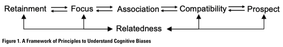
In searching for these mechanisms, Korteling et al. (2018) proposed a neural network framework based on intrinsic brain functions, those that are optimized to perform the perceptual motor skills of human ancestors (System 1). This framework consists of four principles: Association, Compatibility, Retainment, and Focus. Association explains “our inclinations to associate and combine (unrelated) information”; Compatibility explains our inclination to “prioritize information that is compatible with our present state”; Retainment explains our inclinations to “retain given information that sometimes could better be ignored”; and Focus explains our inclinations to “focus dominant information while ignoring relevant information that is not directly activated” (p. 1). Complementary rather than mutually exclusive, these four principles explain the workings of a great many cognitive biases.
Bar (2007) brought a similar perspective to understanding human cognition in information use. He suggests that humans approach information by first associating it with representations in their memory. If they find an analogy, they then make predictions to guide their subsequent actions. From this theory arise three concepts that are reminiscent of Korteling et al.’s (2018) framework: Association, Analogy, and Prediction. The brain searches for not only “what it is” but “what it is like,” a process of analogy-making rather than merely recognition and recall. This point echoes technical communication work (St. Amant, 2017). Like the aforementioned principle of compatibility, analogy creates a margin of error where human judgment can go awry.
Kosslyn et al. (2012) proposed eight cognitive communication principles for human information use. When users encode information, they need to identify clear patterns (the principle of discriminability), organize information into sense-making clusters (perceptual organization), and focus their attention on important matters (salience). The user then integrates new information into working memory, during which they retain limited information (limited capacity) and are sensitive to changes (informative change). When accessing long-term memory, the user needs relevant prior knowledge (appropriate knowledge), searches for compatible memories (compatibility), and expects only relevant information without redundancies (relevance).
The scholarship on cognition and information use roughly converges on the principles of Association, Compatibility, Retainment, and Focus. Although these principles are essential for technical communicators, they are incomplete in addressing emerging problems in technical communication. For example, they do not shed much light on how cognitive biases affect decisions about the future, as Korteling et al. (2018) acknowledged and I discussed earlier. Also missing is the exploration of the role social context plays in information use. For these aspects, I turn to two other theories.
An array of cognitive biases exists in the realm of human decisions about the future. These decisions frequently involve assessing potential gains and losses and deciding whether to stay put or to change course. Much scholarly discussion on this topic was set forth by the landmark essay “Prospect Theory: An Analysis of Decision under Risk” (Kahneman & Tversky, 1979). Considered “the best available description” of human risk evaluation, prospect theory suggests that humans tend to weigh losses more significantly than gains of equal size (Barberis, 2013, p. 173), a cognitive bias known as loss aversion, a point to which I shall return.
More importantly, what is considered loss or gain depends on a reference point that is a moving target. Often the reference point is the status quo, giving us the status quo bias, a tendency to favor the current state over alternative states. One effect of the status-quo bias is that humans often favor what they have over what they do not have of equal value (Tversky & Kahneman, 1991). They are found to demand twice as much to sell what they have than to acquire it (Thaler & Sunstein, 2009). This phenomenon is known as the endowment effect (Thaler & Sunstein, 2009). Prospect theory has been extensively applied in economic behavior and has recently intrigued technical communicators and user experience professionals (Harley, 2016; Luo et al., 2021). For our users, assessing the prospect of their actions and goals is a routine part of their information use. It is therefore crucial to find out how users decide to stay in the status quo or enact change, to opt-in or out, to expect gain or prevent loss. For these reasons, I consider Prospect a pillar in the understanding of cognitive biases.
Furthermore, one approach that forms part of the bedrock for studying the effects of social contexts on human behavior is the Self-Determination theory (Deci & Ryan, 1985; Peters et al., 2018). This well-validated theory identifies three keys to human motivation and engagement: autonomy (having agency to pursue one’s goals), competence (having the ability to pursue one’s goals), and relatedness (having the social support to pursue one’s goals). In particular, relatedness refers to connections with others and a sense of belonging. It comes into play when, for example, websites warn users of goods going out of stock, social media shows what the user has missed out on, or businesses employ dark UX patterns to deceive users (Gray et al., 2018). Relatedness provides the frame by which we can understand the effects of social contexts and the cognitive biases they spawn.
A COGNITIVE FRAMEWORK
Based on the literature in technical communication and cognitive biases, I assemble six principles that can help technical communicators understand cognitive biases in their work: Retainment, Focus, Association, Compatibility, Prospect, Relatedness (RFACPR). Instead of following Korteling et al.’s (2018) unordered list of principles, I assemble my principles with the aim to map them to a typical scene of technical communication. As shown in Figure 1, when a user comes into contact with new information, they retain more than what helps them (retainment, Kosslyn et al., 2012); they are drawn to prominent information that takes their attention away from other information (focus); they then associate new information with past experience that is exactly or metaphorically compatible (association and compatibility); after that, they must anticipate the future outcome and decide on their next move (prospect); throughout this journey, the user is susceptible to the influence of social surroundings (relatedness). This scene follows the general phases the user takes to respond to the present, retrieve the past, and determine the future. These phases are not necessarily linear, but they provide some affordances to understand cognitive activities in technical communication.
In this section, I exemplify cognitive biases that are best represented by each of the six principles. A list of the definitions of the principles and biases can be found in Table 1. I then analyze the application of the principles in information visualization with examples. I extrapolate a set of questions, shown in Table 2, that technical communicators can use in their research of the user and context. These questions for information visualization can be adapted to a plethora of technical communication activities.

Retainment
The Retainment principle refers to the human tendency to integrate helpful information with unhelpful information indiscriminately (Korteling et al., 2018). Research has repeatedly dispelled the belief that the more information we receive, the better we make decisions. On the contrary, too much information dissipates our attention on productive information and exhausts our cognitive resources (Thaler & Sunstein, 2009; Levitin, 2014). Retainment interferes with our memory formation as it blurs the boundary between new and past experiences (Kosslyn & Koenig, 1992). Human memory, after all, is not an objective and complete chronicle of past events but the result of continual enrichment and alteration (Levitin, 2014). The Retainment principle manifests itself in the anchoring bias, the endowment bias, the hindsight bias, the outcome bias, the Dunning Kruger effect, and the overconfidence bias (Korteling et al., 2018).
Anchoring
The anchoring bias refers to the human tendency to make judgments based on the first piece of information (Kahneman, 2011; Korteling et al., 2018). Often the information we come across first serves as the “anchor” to subsequent interpretations (Zhou, 2020).
Hindsight
The hindsight bias refers to the human tendency to perceive a past event as easily predictable (Mohanani et al., 2018). This “knew-it-all-along” bias happens because humans crave an orderly and predictable world (Chabris & Simons, 2010). Upon knowing the outcome of an unpredictable event, we distort memory to create a coherent story to make sense.
Outcome
The outcome bias refers to the human tendency to judge an event based on its outcome rather than its overall development (Baron & Hershey, 1988). This is because the outcome is often more salient and easier to remember than the murky process.
Dunning-Kruger and Overconfidence
These two biases revolve around the idea that the human sense of confidence can be misaligned with competence. The Dunning-Kruger bias refers to the tendency for less knowledgeable people to overestimate their competence and more knowledgeable people to underestimate theirs (Kruger & Dunning, 1999). The overconfidence bias refers to the human tendency to overestimate their competence (Kruger & Dunning, 1999).
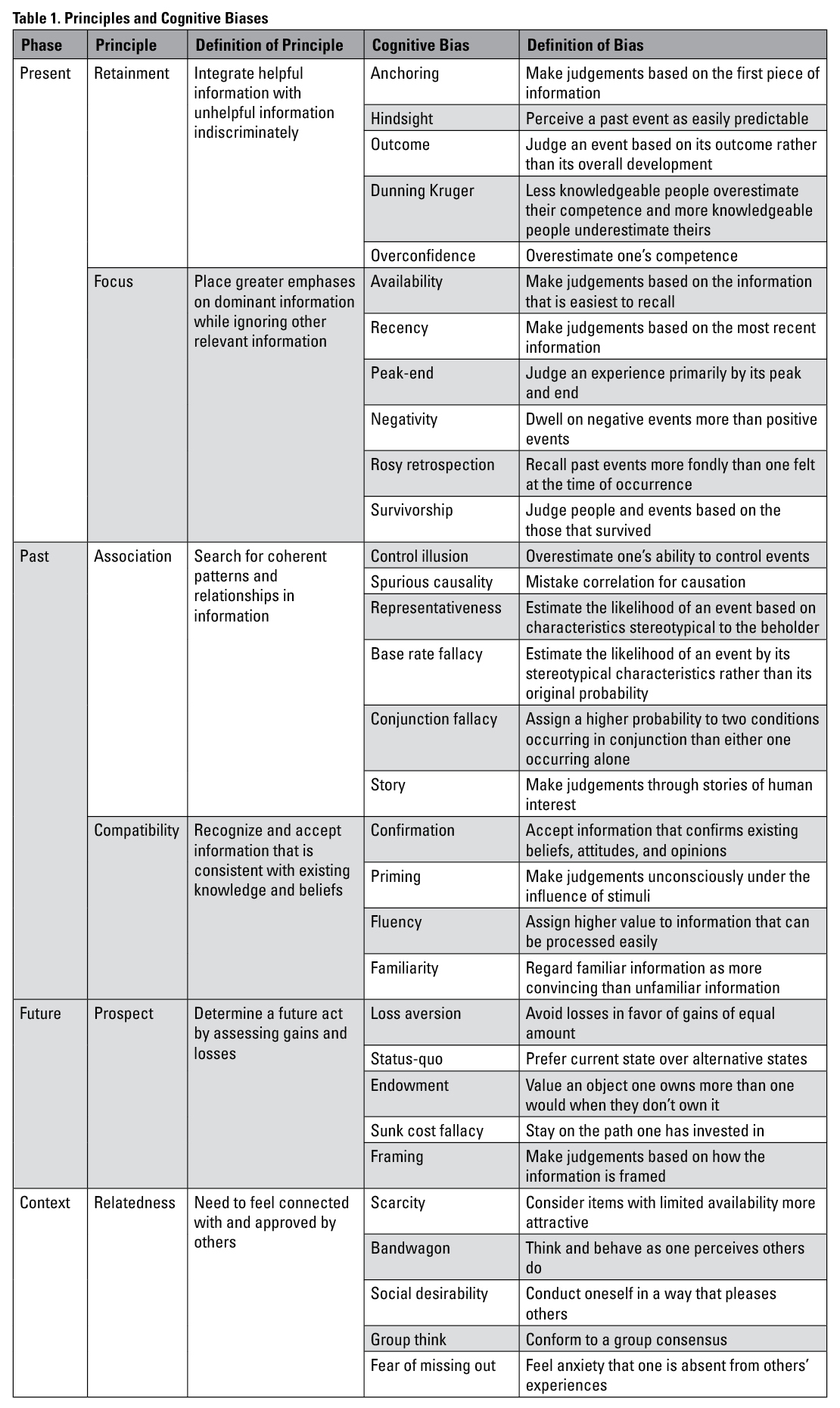
Understanding retainment can help technical communicators tackle a major problem in information visualization: the need to provide appropriate data provenance (Stephens et al., 2015; Richards, 2018; Lindgren, 2021). Data provenance include data sources, collection criteria, inclusivity, and other “known unknowns” (Lindgren, 2021). It might be seen as supplemental, but it can be crucial. A vivid example is the comparison of COVID-19 cases among several countries in Figure 2 (Hasell et al., 2020; Lindgren, 2021). COVID-19 case count in the U.S. significantly lagged behind that in South Korea in early March 2020, but rapidly exceeded it in late March that year. If the visualization shows just case counts, the user might succumb to this anchoring effect and see new infections as the only source of the increase in cases. Nevertheless, the disparities in testing efforts between the U.S. and South Korea largely explain this startling change (Lindgren, 2021). Visualizing the disparities offer crucial data provenance.
 Just as important is the designer’s decision to focus on “confirmed cases,” a term that is not to be confused with a general concept of cases which can include probable cases (Lindgren, 2021). Everyday users might understandably not think of such specialized language in public health.
Figure 2 ought to remind technical communicators to look beyond the data at hand. Lying hidden are the data provenance and the precondition that generates data. Thinking critically can help mitigate the overconfidence bias in technical communicators. Visualizing such data provenance can mitigate the Dunning-Kruger effect on users, preventing them from rushing to conclusions.
Focus
The principle of Focus refers to the human tendency to place greater emphasis on dominant information while ignoring other relevant information (Korteling et al., 2018). Kahneman (2011) described this phenomenon as “what you see is all there is.” The human brain works like a magnifying glass (Chabris & Simons, 2010). Our attention is drawn to information that is readily available, visually salient, or mentally stimulating. We inadvertently ignore information that is obscured from view (Zhou, 2020). While the aforementioned Retainment principle refers to taking in too much unhelpful information, the Focus principle refers to placing emphases on too little information at the expense of other helpful information. It manifests itself in the availability bias, the recency bias, the peak-end rule, the negativity bias, the rosy retrospection bias, and the survivorship bias.
Availability
The availability bias refers to the human tendency to make judgments based on information that is easiest to recall (Thaler & Sunstein, 2009). Problems arise when that information is not helpful or is incomplete. Thaler and Sunstein (2009) demonstrated that people are more likely to purchase insurance shortly after experiencing a natural disaster because the traumatic experience became the most available information.
Recency
The recency bias refers to the human tendency to make judgments based on the most recent information (Mohanani et al., 2018). Our short-term memory captures and stores a small number of items for a short time (Chabris & Simons, 2010). As such, we end up disregarding important information we encounter earlier.
Peak-end
The peak-end rule refers to the human tendency to judge an experience primarily by its peak and end (Kahneman et al., 1993; Cockburn et al., 2015). Kahneman et al. (1993) discovered that patients judged their experience of pain disproportionately by the peak and end rather than by the actual amount of pain they felt.
Negativity and Rosy Retrospection
The negativity bias refers to the human tendency to dwell on negative events more than positive events (Wu, 2013). Negative events can become anchors, peaks, and ends that trigger the aforementioned biases. On the other hand, rosy retrospection refers to the human tendency to recall past events more fondly than one felt at the time of occurrence (Mitchell & Thompson, 1994).
Survivorship
The survivorship bias refers to the human tendency to judge people and events based on those that survived (Ellenberg, 2014). Harford (2021) documents a World War II case in which some bombers laden with bullet holes successfully returned while others did not. After examining the areas struck by bullets, engineers realized that the other areas that were not struck by bullets may hold the key. It may well be that the bombers that did not return were struck in these other areas.
In information visualization, the focus should be drawn to elements most conducive in understanding the message. When it comes to cognitive biases, a shallow audience analysis must give way to deeper probing of the events, stories, and images that come to the user’s mind first. It is only through this probing that the technical communicator can peek into the user’s most available sources, recent experiences, peak and end points, and negative and rosy memories and link them with information visualization. More helpful is to ask the user to articulate these events in detail. Doing so provides a user vocabulary and perspective through which technical communicators can effectively attract, inform, and guide users.
Additionally, one way to mitigate the survivorship bias is to think about what data is not available and what it takes for data to survive. Take Figure 2, for example. Without the information about testing, case numbers alone could trigger the survivorship bias.
Association
The principle of Association refers to the human tendency to search for coherent patterns and relationships in information (Korteling et al., 2018; Bar, 2007). Humans have an innate urge to recognize patterns and perceive relationships in randomness (Levitin, 2014). We tend to construct causality when there is none and sometimes mistake the direction of causality (Schiller, 2019). We often do not have a natural instinct to gauge statistical probability (Thaler & Sunstein, 2009). The principle of Association manifests itself in the control illusion, spurious causality, the representativeness bias, base rate fallacy, conjunction fallacy, and the story bias (Korteling et al., 2018).
Control Illusion
The control illusion refers to the human tendency to overestimate one’s ability to control events (Langer, 1975). At the core of this bias is the belief that the outcomes of our actions are due to our skill or competency, not luck or chance (Langer, 1975). When real control is absent, the illusion of control can still keep people engaged in an activity (Langer, 1975).
Spurious Causality
Spurious causality refers to the human tendency to mistake correlation for causation (Chabris & Simons, 2010). It typically happens when one event seems to cause another event, but in reality, both are correlated to a third independent variable. Suppose the data shows the number of falling injuries rising with the consumption of apple cider. Neither falling injuries nor apple cider consumption increases the likelihood of the other, but a third variable, winter, likely causes both variables to rise.
Representativeness
The representativeness bias refers to the human tendency to estimate the likelihood of an event based on characteristics most stereotypical to the beholder (Thaler & Sunstein, 2009; Chabris & Simons, 2010). This pervasive bias causes humans to overestimate the probability of events such as plane crashes or terrorist attacks, in contrast with more mundane events (Thaler & Sunstein, 2009).
Base Rate Fallacy and Conjunction Fallacy
Base rate fallacy refers to the human tendency to estimate the likelihood of an event by its stereotypical characteristics rather than its original probability (Thaler & Sunstein, 2009). The conjunction fallacy is slightly different. It refers to the human tendency to assign a higher probability to two conditions occurring in conjunction than either one occurring alone (Tversky & Kahneman, 1983). An infamous example of these biases is the “Linda problem.” In a Tversky and Kahneman (1983) experiment, participants were asked to assess if Linda, a fictitious woman passionate about women’s rights, is more likely to be a bank teller or a bank teller who is active in the feminist movement. The vast majority of participants chose the latter. The problem is that the probability of Linda being both a bank teller and a member of the feminist movement, a conjunct condition, cannot be higher than the probability of her being a bank teller.
Story
The story bias refers to the human tendency to make judgments through stories of human interest (Schiller, 2019). In Narrative Economics, Schiller (2019) demonstrates how stories drive major economic and political events. A classic example is the Laffer Curve, a graph that tells a compelling story of how increasing the tax rate might decrease tax revenue. Although economists later questioned its dubious thesis, the elegant Laffer Curve story helped generate political activism in the 1980s in the U.S. (Schiller, 2019).
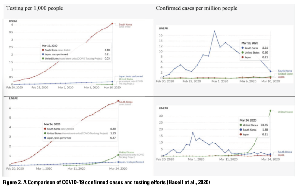
In information visualization, technical communicators should think about what variables need to be presented to help users differentiate correlation from causation. Figure 3A shows the life expectancy and the annual cigarette consumption per person above age 14 in many nations (Cairo, 2019). Upon first sight, users might conclude that the more one smokes, the longer one lives. However, what Figure 3A does show is a correlation between the two variables, not causation. Seeing causation leads to spurious causality and conjunction fallacy. The decision to organize the data by just two variables is arbitrary because there are other important variables to consider. For instance, wealthy nations tend to have longer life expectancies (Cairo, 2019). Individuals in these nations might buy cigarettes more. These can be clearly seen in Figure 3B, where income-level is revealed (Cairo, 2019). The positive correlation looks even weaker when countries are separated by income-level into three charts (Figure 3C), a recommended strategy of side-by-side display of multiple data angles (Cairo, 2019).
Finally, in Figure 3D, the correlation becomes rightfully negative (Cairo, 2019). Lumping the data by nation tends to convolute socioeconomic factors. Instead, Figure 3D focuses on individuals. An 80-year-old cigarette smoker has just about half the survival rate of a non-smoker or someone who stopped smoking years ago (Cairo, 2019).
This example shows that technical communicators ought to investigate ways that a false association can form and variables that can support accurate understanding. This investigation can materialize Wolfe’s (2015) notion of “interpretive levels.” With several variables, technical communicators need to contemplate on how data can be conveyed in multiple layers and facets (Stephens et al., 2015).
Another lesson to keep in mind is that data often must be put in perspective by considering adjusted value and base rate (Cairo, 2019; Harford, 2021), for instance, when data sources span vast distances of time and geography. Tufte’s (1983) point that designers should consider numbers adjusted for inflation is an excellent metaphor.
Moreover, users are offered increasing autonomy to control and interact with visualizations (Richards, 2018). Technical communicators could use control to allow users to see multiple dimensions of the data; they should also beware that the control illusion can evoke false confidence in users.
Figure 3 demonstrates both the susceptibility of information visualization to cognitive biases and the power of information visualization to mitigate cognitive biases. The result is a kind of technical communication that is clear and eloquent.
Compatibility
The principle of Compatibility refers to the human tendency to recognize and accept information that is consistent with existing knowledge and beliefs (Korteling et al., 2018). To accomplish this, humans take the cues provided by the available information to retrieve those with compatible characteristics (Bar, 2007). The principle of compatibility manifests in the confirmation bias, the priming bias, the fluency bias, and the familiarity bias (Korteling et al., 2018).
Confirmation
The confirmation bias refers to the human tendency to accept information that confirms preexisting beliefs, attitudes, and opinions (Mohanani et al., 2018). It leads humans to question or disregard disconfirming evidence.
Priming
The priming bias refers to the human tendency to make judgments unconsciously under the influence of stimuli (Thaler & Sunstein, 2009). For instance, in one study, users were provided a set of related words. Later when they were asked to recall these words, they recalled words that were not provided (Chabris & Simons, 2010).
Fluency, Familiarity
The fluency bias refers to the human tendency to assign a higher value to information that can be processed easily (Effectiviology). The familiarity bias refers to the human tendency to regard familiar information as more convincing than unfamiliar information (Effectiviology).
When creating visualizations, technical communicators should ask what preexisting beliefs the user holds that can trigger cognitive biases. Confirmation bias is particularly relevant when many users are skeptical and apathetic to a topic, such as science and the environment (Richards, 2018). Figure 3A can reinforce the confirmation and availability biases held by those who believe that smoking cigarettes is beneficial to one’s health. To uncover users’ beliefs, technical communicators can investigate the characteristics of the target users and hold meaningful conversations with user representatives.
Another question to ask, with regard to the priming bias, is how visual elements affect the user’s initial response and thus set the user in the wrong direction. The use of color, for instance, can prime users to form (mis)perceptions (Kostelnick et al., 2013) and can also interfere with the user’s assessment of risks (Stephens et al., 2015). Figure 3A and 3B invite the user to see the data in two very different ways. With the color coding in Figure 3B, the user is primed to discern different categories of nations. Without it, the user sees an overall pattern that appears to run contrary to science.
Prospect
The principle of Prospect guides humans to determine a future act by assessing gains and losses. It manifests in loss aversion, status-quo bias, sunk cost fallacy, endowment effect, and framing bias.
Loss Aversion
Loss aversion refers to the human tendency to avoid losses in favor of gains of equal amounts (Kahneman, 2011). Losing $100 looms larger than gaining it. If what we have is perceived to be safer, we tend to resist change; if an alternative is perceived to be safer, we tend to embrace change (Thaler & Sunstein, 2009).
Status-Quo
The status-quo bias refers to the human tendency to prefer the current state over alternative states (Thaler & Sunstein, 2009). It means that what we have as default significantly influences what we do next.
Endowment Effect and Sunk Cost Fallacy
The endowment effect refers to the human tendency to value an object one owns more than one would when they don’t own it (Kahneman et al., 1991). In other words, it takes more to give up an object than it does to acquire it (Kahneman et al., 1991). A related bias is sunk cost fallacy, which refers to the human tendency to stay on the path one has invested in (Thaler & Sunstein, 2009).
Framing
The framing bias refers to the human tendency to make judgments based on how the information is framed (Thaler & Sunstein, 2009). This phenomenon is usually known as the bottle-half-full versus the bottle-half-empty. Saying that one has a 10% chance of catching a virus might worry people more than saying that one has 90% chance of being safe.
One of the most frequently documented factors in information visualization is the time frame. The choice of time frame can greatly influence user perception of trends. Politically motivated visualizations often select a favorable time frame to present trends in economic performance and social progress (Cairo, 2019). For instance, they can bring the user to focus on a decline in numbers in a short time period and obscure an overall rise of numbers in a longer period (Cairo, 2019). Here, biases such as anchoring, priming, overconfidence, and loss aversion can lead the user to make unrealistic judgments. In visualizations, technical communicators should pay close attention to the time span and the overall fluctuation of data.
Data granularity also matters. In the 2016 U.S. presidential election, maps that showed votes by county could suggest overwhelming support for the Republican Party, whereas maps that showed citizen votes and population density could foster a more educated understanding (Cairo, 2019). To someone unfamiliar with U.S. elections, these visualizations can create dramatic misjudgments of prospects.
Relatedness
The principle of Relatedness refers to the human need to feel connected with and approved by others (Deci & Ryan, 1985). User behavior is increasingly influenced by the availability of social data that evokes relatedness. The principle of Relatedness manifests itself in the scarcity bias, the bandwagon effect, the social desirability bias, groupthink, and the fear of missing out bias.
Scarcity
The scarcity bias refers to the human tendency to consider items with limited availability more attractive (Thaler & Sunstein, 2009). Marketers often create a sense of scarcity by counting down the time left on a sale, reminding users a product is low in stock or showing real-time purchases by others.
Bandwagon Effect
The bandwagon effect refers to the human tendency to think and behave as they perceive others do (Mohanani et al., 2018). Humans perceive behaviors accepted by others to be appropriate.
Social Desirability and Groupthink
The social desirability bias refers to the human tendency to conduct oneself in a way that pleases others (Tyrkiel, 2020). Groupthink refers to the human tendency to conform to a group consensus (Swanson, 2013). Both biases can cloud our judgments and even censor our views.
Fear of Missing Out
The fear of missing out (FoMO) bias refers to the human tendency to feel anxiety that one is absent from others’ experiences (Przybylski et al., 2013). Like the scarcity bias and loss aversion, FoMO plays into our fear that we are losing sight of and losing out on benefits and pleasure.
Relatedness permeates information visualization through the increasing use of social data. Technical communicators must carefully consider the ethical reasons for conveying social data. They should only use scarcity to provide meaningful information and not to purely encourage impulsive behaviors.
When conveying opinions and actions of other people, technical communicators should consider if the data is drawn from a selective sample, is based on self-reporting, and thus can perpetuate socioeconomic disparities. Harford (2021) documents several ways public opinion visualizations can introduce a sampling bias; a survey can get a disproportionate number of wealthier respondents when the channel it uses perpetuates this pattern. Based on the troubling pattern, the bandwagon effect can further mislead (nudge) the user to adopt behaviors and predict the future, thus triggering prospect-related biases. Understanding relatedness can help technical communicators create work that fosters accurate observations and informed decisions of personal and public significance.
To put it all together, the principles of Retainment, Focus, Association, Compatibility, Prospect, and Relatedness (RFACPR) can be used to address technical communication problems that are caused by cognitive biases and can be alleviated by understanding cognitive biases.
CONCLUSION AND FUTURE RESEARCH
Many activities in technical communication, including information visualization, are not only prone to cognitive biases but can become an effective way to mitigate biases. The framework I introduced in this article, along with the sample questions, are intended to turn general principles into operable activities. It is my hope that this framework will provide a new lens and new ways to communicate empathetically.
This work presents ample opportunities for further research. First, future research can examine specific cognitive biases and their role in particular technical communication contexts. Second, research is needed to study different types of tasks and their susceptibility to cognitive biases. It will yield generalizable strategies to better these tasks and contribute to the field’s body of knowledge. Third, research can devise design techniques that help (and nudge) individuals and organizations to use information more effectively.
Acknowledgement
The author would like to thank Dr. Pieter Jan Stappers of Delft University of Technology (The Netherlands) for supporting his sabbatical teaching and research in cognitive biases and design.
References
Bar, M. (2007). The proactive brain: using analogies and associations to generate predictions. Trends in Cognitive Sciences, 11(7), 280–289. https://doi.org/10.1016/j.tics.2007.05.005
Barberis, N. C. (2013). Thirty years of prospect theory in economics: A review and assessment. Journal of Economic Perspectives, 27(1), 173–195. https://www.jstor.org/stable/41825467
Brühl, J., Smith, G., & Visser, M. (2019). Simple is good: Redesigning utility bills to reduce complexity and increase understanding. Utilities Policy, 60. https://doi.org/10.1016/j.jup.2019.100934
Cairo, A. (2019). How Charts Lie. New York, NY: W. W. Norton & Company.
Chabris, C. F., & Simons, D. J. (2010). The Invisible Gorilla: And Other Ways Our Intuitions Deceive Us. New York, NY: Crown.
Cockburn, A., Quinn, P., & Gutwin, C. (2015). Examining the peak-end effects of subjective experience. Proceedings of the 2015 Annual ACM Conference on Human Factors in Computing Systems, 357–366. ACM Digital Library. https://doi.org/10.1145/2702123.2702139
Deci, E. L., & Ryan, R. M. (1985). Intrinsic Motivation and Self-Determination in Human Behavior. New York: Plenum.
Delin, J., Searle-Jones, A., & Waller, R. (2006). Branding and relationship communications: The evolution of utility bills in the UK. In Carliner, S., Verckens, J. P., & Waele, C. (Eds.) Information and Document Design: Varieties on Recent Research. John Benjamins Publishing.
Dragga, S., & Voss, D. (2001). Cruel pies: The inhumanity of technical illustrations. Technical Communication, 48, 265–274.
Effectiviology. The Rhyme-as-Reason Effect: Why Rhyming Makes Your Message More Persuasive. Retrieved December 5, 2021, from https://effectiviology.com/rhyme-as-reason
Ellenberg, J. (2014). How Not To Be Wrong: The Power of Mathematical Thinking. New York, NY: Penguin.
Ellis, G. (Eds.). (2018). Cognitive Biases in Visualizations. Cham: Switzerland: Springer. doi: https://doi.org/10.1007/978-3-319-95831-6
Gray, C. M., Kou, Y., Battles, B., Hoggatt, J., Toombs, A. L. (2018). The dark (patterns) side of UX design. Proceedings of the 2018 CHI Conference on Human Factors in Computing Systems, 1–14. ACM Digital Library. https://doi.org/10.1145/3173574.3174108
Harford, T. (2021). The Data Detective: Ten Easy Rules to Make Sense of Statistics. New York, NY: Riverhead Books.
Harley, A. (2016). Prospect theory and loss aversion: How users make decisions. Nielsen Norman Group. Retrieved December 5, 2021, from https://www.nngroup.com/articles/prospect-theory/
Hasell, J., Ortiz-Ospina, E., Mathieu, E., Ritchie, H., Beltekian, D., Macdonald, B., & Roser, M. (2020, March 31). To understand the global pandemic, we need global testing. Our World in Data. https://ourworldindata.org/covid-testing
Kahneman, D. (2011). Thinking, Fast and Slow. New York, NY: Farrar, Straus and Giroux.
Kahneman, D., Fredrickson, B. L., Schreiber, C. A., & Redelmeier, D. A. (1993). When more pain is preferred to less: Adding a better end. Psychological Science, 4(6), 401–405. https://www.jstor.org/stable/40062570
Kahneman, D., Knetsch, J. L., & Thaler, R. H. (1991). Anomalies: the endowment effect, loss aversion, and status quo bias. Journal of Economic Perspectives, 5(1), 193–206.
Kahneman, D., & Lovallo, D. (1993). Timid choices and bold forecasts: A cognitive perspective on risk taking. Management Science, 39(1), 17–31. http://www.jstor.org/stable/2661517
Kahneman, D., & Tversky, A. (1979). Prospect Theory: An analysis of decision under risk. Econometrica, 47(2), 263–292. https://doi.org/10.2307/1914185
Korteling, J. E., Brouwer, A-M., & Toet, A. (2018). A neural network framework for cognitive bias. Frontiers in Psychology, 9. https://doi.org/10.3389/fpsyg.2018.01561
Kosslyn, S. M., & Koenig, O. (1992). Wet Mind: The New Cognitive Neuroscience. New York: Free Press.
Kosslyn, S. M., Kievit, R. A, Russell, A. G., & Shephard, J. M. (2012). PowerPoint presentation flaws and failures: a psychological analysis. Frontiers in Psychology, 3. https://doi.org/10.3389/fpsyg.2012.00230
Kostelnick, C. (2016). The re-emergence of emotional appeals in interactive data visualization. Technical Communication, 63(2), 116–135.
Kostelnick, C., & Roberts, D. D. (2010). Designing Visual Language: Strategies for Professional Communicators. New York, NY: Longman.
Kostelnick, J. C., McDermott, D., Rowley, R. J., & Bunnyfield, N. (2013). A cartographic framework for visualizing risk. Cartographica, 48, 200–224. Doi: 10.3138/carto.48.3.1531
Kruger, J., & Dunning, D. (1999). Unskilled and Unaware of It: How Difficulties in Recognizing One’s Own Incompetence Lead to Inflated Self-Assessments. Journal of Personality and Social Psychology, 77(6), 1121–1134. doi:10.1037/0022-3514.77.6.1121.
Langer, E. J. (1975). The illusion of control. Journal of Personality and Social Psychology, 32(2), 311–328.
Levitin, D. J. (2014). The Organized Mind: Thinking Straight in the Age of Information Overload. New York, NY: Dutton.
Lindgren, C. A. (2021). Facts upon delivery: What is rhetorical about visualized models? Journal of Business and Technical Communication, 35(1), 65–72.
Luo, K., Dang, S. P., Shihada, B., & Alouini, M-S. (2021, March 23). Prospect theory for human-centric communications. Frontiers in Communications and Networks. https://doi.org/10.3389/frcmn.2021.634950
Mitchell, T. R., & Thompson, L. (1994). A Theory of temporal adjustments of the evaluation of events: rosy prospection and rosy retropspection. In C. Stubbart, J. Porac, & J. Meindl (Eds.), Advances in Managerial Cognition and Organizational Information-Processing (Vol. 5), 85–114. JAI Press.
Mohanani, R., Salman, I., Turhan, B., Rodríguez, P., & Ralph, P. (2018). Cognitive biases in software engineering: A systematic mapping study. IEEE Transactions on Software Engineering, 46(12), 1318–1339. doi: 10.1109/TSE.2018.2877759
Perelman, C., & Olbrechts-Tyteca, L. (1969). The New Rhetoric. Notre Dame, ID: University of Notre Dame Press.
Peters, D., Calvo, R. A., & Ryan, R. M. (2018). Designing for motivation, engagement and wellbeing in digital experience. Frontiers in Psychology, 9. https://doi.org/10.3389/fpsyg.2018.00797
Przybylski, A. K., Murayama, K., DeHaan, C. R., & Gladwell, V. (2013). Motivational, emotional, and behavioral correlates of fear of missing out. Computers in Human Behavior, 29, 1841–1948. http://dx.doi.org/10.1016/j.chb.2013.02.014
Rawlins, J. D., & Wilson, G. D. (2014). Agency and interactive data displays: Internet graphics as co-created rhetorical spaces. Technical Communication Quarterly, 23, 303–322.
Richards, D. P. (2018). Not a cape, but a life preserver: The importance of designer localization in interactive sea level rise viewers. Communication Design Quarterly, 6(2), pp. 57–69.
Roundtree, A. (2013). Computer Simulation, Rhetoric, and the Scientific Imagination. Lanham, MD: Lexington Books.
Schiller, R. J. (2019). Narrative Economics: How Stories Go Viral & Drive Major Economic Events. Princeton, New Jersey: Princeton University Press.
Schultz, L. D., & Spyridakis, J. (2004). The effect of heading frequency on comprehension of online information: A study of two populations. Technical Communication, 51(4), 504–516.
St. Amant, K. (2017). Of scripts and prototypes: A two-part approach to user experience design for international contexts. Technical Communication, 64(2).
Stephens, S. H., DeLorme, D. E., & Hagen, S. C. (2015). Evaluating the utility and communicative effectiveness of an interactive sea-level rise viewer through stakeholder engagement. Journal of Business and Technical Communication, 29(3), 314–343.
Swanson, G. (2013). Getting fruitful collaboration instead of stale groupthink. UX Magazine. Retrieved December 5, 2021, from https://uxmag.com/articles/getting-fruitful-collaboration-instead-of-stale-groupthink
Thaler, R. H., & Sunstein, C. R. (2009). Nudge. New York, NY: Penguin.
Tufte, E. R. (1983). Visual Display of Quantitative Information. Cheshire, CT: Graphics Press.
Tversky, A., & Kahneman, D. (1983). Extensional versus intuitive reasoning: The conjunction fallacy in probability judgment. Psychological Review, 90(4), 293–315. https://doi.org/10.1037/0033-295X.90.4.293
Tversky, A., & Kahneman, D. (1991). Loss aversion in riskless choice: A reference-dependent model. The Quarterly Journal of Economics, 106(4), 1039–1061. http://www.jstor.org/stable/2937956
Tyrkiel, K. (2020). Cognitive bias in UX: The user side and the designer side. Livesession. Retrieved December 5, 2021, from https://livesession.io/blog/post/cognitive-bias-ux/
Verhulsdonck, G., & Shah, V. (2021). Lean data visualization: Considering actionable metrics for technical communication. Journal of Business and Technical Communication, 35(1), 57–64.
Verhulsdonck, G., & Shalamova, N. (2019). Creating content that influences people: Considering user experience and behavioral design in technical communication. Journal of Technical Writing and Communication, 50(4), 376–400. https://doi.org/10.1177/0047281619880286
Wesslen, R., Karduni, A., Markant, D., & Dou, W. (2022). Effect of uncertainty visualizations on myopic loss aversion and equity premium puzzle in retirement investment decisions. IEEE Transactions on Visualization and Computer Graphics. 28(1). 454–464.
Wolfe, J. (2015). Teaching students to focus on the data in data visualization. Journal of Business and Technical Communication, 29(3), 344–359.
Wu, P. F. (2013). In search of negativity bias: An empirical study of perceived helpfulness of online reviews. Psychology & Marketing, 30(11), 971–984. https://doi.org/10.1002/mar.20660
Xiong, C., Weelden, L., & Franconeri, St. (2020). The curse of knowledge in visual data communication. IEEE Transactions on Visualization and Computer Graphics, 26(10). 3051–3062.
Young, I. (2015). Practical Empathy: For Collaboration and Creativity in Your Work. Brooklyn, NY: Rosenfeld Media.
Zhang, Y., Bellamy, R. K. E., & Kellogg, W. A. (2015). Designing information for remediating cognitive biases in decision-making. Proceedings of the 33rd Annual ACM Conference on Human Factors in Computing Systems, 2211–2220. doi: https://doi.org/10.1145/2702123.2702239
Zhou, Q. (2020). Cognitive biases in technical communication. Proceedings of the 2020 IEEE International Professional Communication Conference (ProComm), 39–46. doi: 10.1109/ProComm48883.2020.00012
Zuk, T., & Carpendale, S. (2007). Visualization of uncertainty and reasoning. Proceedings of the 8th international symposium on Smart Graphics, 164–177. doi: https://doi.org/10.1007/978-3-540-73214-3_15
Dr. Quan Zhou is a Professor and Chair of the Department of Technical Communication and Interaction Design at Metropolitan State University (USA). He is also the director of the Design of User Experience graduate certificate. His research interests include the cognitive aspects of technical communication and human-centered design. He can be reached at quan.zhou@metrostate.edu.